6 posts tagged with "React"

View All Tags

React Dual Range Price Slider with Min and Max Input

· 6 min read
Kamlesh
Quality Assurance @TestKarts

Introduction

Price range filters are crucial for e-commerce platforms, allowing users to narrow down products based on their budget. Our goal is to build a React component that provides a user-friendly interface for selecting a price range, with synchronized slider and input values, and optimized performance.

The Plan

The CatlogPriceFilter component will have the following key features:

  1. Range Slider: Users can adjust minimum and maximum values using a range slider.
  2. Input Fields: Numeric input fields allow users to manually input the price range.
  3. Synchronized State: The slider and input fields will be in sync, meaning changes in one will reflect in the other.
  4. Price Change Event: A callback function will be triggered when the user finishes adjusting the price range.

How to Optimize React Performance

· 9 min read
Kamlesh
Quality Assurance @TestKarts

React is a robust library for building dynamic user interfaces, but as applications scale, performance can become a significant concern. This guide delves into various techniques and best practices for enhancing React application performance, ensuring a smooth and responsive user experience.

PhonePe Payment Gateway Integration

· 8 min read
Kamlesh
Quality Assurance @TestKarts

This tutorial will guide you through the process of integrating the PhonePe Payment Gateway in your Node.js backend and React frontend. We'll use the provided backend code for payment processing and show how to build the frontend with React, React Router DOM, React Bootstrap, and Axios.

Dynamically Adding Input Fields Using React.js

· 4 min read
Kamlesh
Quality Assurance @TestKarts

Managing dynamic input fields in React.js is a common requirement for modern web applications. Whether you’re building a form that allows users to add multiple email addresses, phone numbers, or any other type of information, dynamically adding and removing input fields can significantly enhance user experience.

In this article, we’ll walk through the process of creating a form with dynamic input fields in React.js. Our form will allow users to add new input fields, delete existing ones, and ensure that at least one input field is always present.

Introduction

Forms are a crucial part of web applications, enabling user interaction and data collection. However, the static nature of traditional forms can be limiting, especially when users need to add multiple entries dynamically. React.js, with its powerful state management and component-based architecture, offers an elegant solution to this problem.

By leveraging React’s capabilities, we can create forms that allow users to add and remove input fields on the fly, providing a more flexible and user-friendly experience. This tutorial will guide you through building such a form step-by-step, covering state management, event handling, and rendering dynamic components.

Setting Up the Project

First, let's create a new React project. If you haven’t already, install the create-react-app tool using npm or yarn.

npx create-react-app dynamic-input-fields
cd dynamic-input-fields
npm start

This will set up a new React project and start the development server.

Creating the DynamicInput Component

Next, we'll create a component called DynamicInput that will handle the dynamic input fields.

Step 1: Initial Setup

Create a new file named DynamicInput.js inside the src directory and add the following code:

import React, { useState } from 'react';

const DynamicInput = () => {
const [inputs, setInputs] = useState([{ value: '' }]);

const handleChange = (index, event) => {
const values = [...inputs];
values[index].value = event.target.value;
setInputs(values);
};

const handleAdd = () => {
setInputs([...inputs, { value: '' }]);
};

const handleRemove = (index) => {
if (inputs.length > 1) {
const values = [...inputs];
values.splice(index, 1);
setInputs(values);
}
};

return (
<div>
{inputs.map((input, index) => (
<div key={index}>
<input
type="text"
value={input.value}
onChange={(event) => handleChange(index, event)}
/>
{inputs.length > 1 && (
<button type="button" onClick={() => handleRemove(index)}>
Remove
</button>
)}
</div>
))}
<button type="button" onClick={handleAdd}>
Add Input
</button>
</div>
);
};

export default DynamicInput;

Step 2: Adding the Component to the App

Open src/App.js and import the DynamicInput component. Then, add it to the component tree:

import React from 'react';
import './App.css';
import DynamicInput from './DynamicInput';

function App() {
return (
<div className="App">
<h1>Dynamic Input Fields</h1>
<DynamicInput />
</div>
);
}

export default App;

Step 3: Styling the Component

You can add some basic CSS to src/App.css to make the form look better:

.App {
font-family: sans-serif;
text-align: center;
}

input {
margin: 5px;
padding: 10px;
}

button {
margin: 5px;
padding: 10px;
}

Understanding the Code

  1. State Management: The inputs state is an array of objects, each containing a value property. This state holds the values of all dynamic input fields.
  2. handleChange Function: This function updates the value of a specific input field based on the user's input.
  3. handleAdd Function: This function adds a new input field by appending an empty object to the inputs array.
  4. handleRemove Function: This function removes an input field at a specified index. It ensures that at least one input field remains by checking the length of the inputs array before allowing deletion.
  5. Rendering the Inputs: The component maps over the inputs array and renders an input field for each item. A remove button is conditionally rendered if there is more than one input field.

Conclusion

Dynamically adding and removing input fields in React.js is a powerful feature that can greatly enhance the flexibility and user-friendliness of your forms. By following the steps outlined in this article, you can implement this functionality in your own projects, ensuring a seamless and interactive user experience.

Remember to consider edge cases, such as preventing the removal of the last input field, to ensure your form behaves as expected.


Pin One Element to Scroll Until Bottom of Second Element

· 7 min read
Kamlesh
Quality Assurance @TestKarts

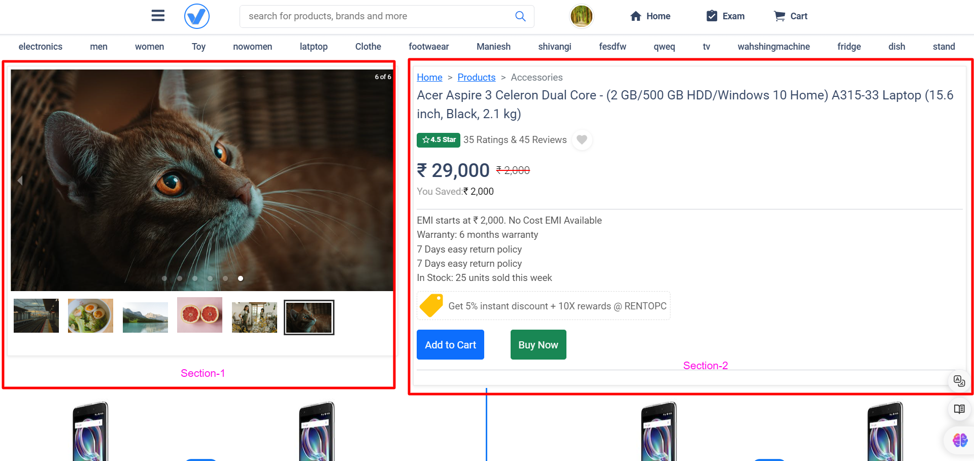
In the vast landscape of web design, certain features can elevate user experience to new heights. One such feature is the combination of scrollable sections and sticky columns, providing a seamless and intuitive browsing experience. In this article, we'll delve into the intricacies of implementing scrollable sections and sticky columns using React and CSS, empowering you to enhance your website's usability and engagement.

Scrolling Particular Section Only

Understanding Scrollable Sections: Scrollable sections are essential for enabling users to navigate through content seamlessly, particularly in lengthy web pages. They offer a structured and organized browsing experience, allowing users to consume information at their own pace. By leveraging React and CSS, developers can implement scrollable sections with ease, offering flexibility and customization options to tailor the experience to users' needs.

Exploring Sticky Columns: Sticky columns play a vital role in keeping essential content visible as users scroll. Whether it's navigation menus, sidebars, or call-to-action elements, sticky columns ensure that important information remains within reach, enhancing user engagement and reducing friction in the browsing experience. By dissecting the provided code snippet, we'll gain insights into how sticky columns are implemented and customized using React and CSS.

Creating a Seamless User Experience: The synergy between scrollable sections and sticky columns is key to creating a seamless user experience. By combining these features, websites can enhance navigation, readability, and overall user engagement. Real-world examples will illustrate how scrollable sections and sticky columns work together to optimize user experience, inspiring you to implement these techniques in your own web projects.

Understanding the Code:

Let's break down the following React code snippet:

import React, { useEffect, useState } from 'react';
import reactLogo from "./assets/react.svg";
import "./App.css";

function App() {
// State to track whether section 1 should be fixed
const [isSection1Fixed, setIsSection1Fixed] = useState(false);

useEffect(() => {
// Function to handle scroll events
const handleScroll = () => {
// Get references to section 1 and section 2
const section1 = document.getElementById('section-1');
const section2 = document.getElementById('section-2');

// Get the top offset of section 1 and section 2
const section1Top = section1.offsetTop;
const section2Top = section2.offsetTop;

// Get the current scroll position
const scrollTop = window.scrollY || document.documentElement.scrollTop;

// Determine if section 1 should be fixed
if (scrollTop > section1Top) {
if (scrollTop < section2Top - window.innerHeight) {
setIsSection1Fixed(true);
} else {
setIsSection1Fixed(false);
}
} else {
setIsSection1Fixed(false);
}
};

// Add event listener for scroll events
window.addEventListener('scroll', handleScroll);

// Clean up by removing event listener when component unmounts
return () => {
window.removeEventListener('scroll', handleScroll);
};
}, []); // Empty dependency array ensures the effect runs only once on component mount

return (
<>
{/* Sticky Header */}
<div className='header'>Sticky Header</div>

{/* Two-item container for left and right columns */}
<div className='two-item-container'>
{/* Left column */}
<div id='sticky' className='item-one'>
{/* Content goes here */}
</div>

{/* Right column */}
<div id='section-1' className={`item-two ${isSection1Fixed ? 'fixed-section' : ''}`}>
{/* Content goes here */}
</div>
</div>

{/* Scrolling section */}
<div id='section-2' className="another-section">
{/* Content goes here */}
</div>
</>
);
}

export default App;

In this code:

  • We import necessary dependencies, including React, icons, and CSS styles.
  • We define a functional component App.
  • We use the useState hook to manage the state of isSection1Fixed, which determines whether the left column (section 1) should be fixed.
  • We use the useEffect hook to add an event listener for scroll events. Inside the effect, we calculate the scroll position and determine whether section 1 should be fixed.
  • We return JSX, which includes the sticky header, two-item container with left and right columns, and a scrolling section.

Now, let's delve into the CSS styles:

.header {
width: 100%;
height: 56px;
background: #72a24d;
top: 0;
position: sticky; /* Keeps the header fixed at the top */
z-index: 999;
padding-left: 12px;
padding-right: 12px;
}

.two-item-container {
position: relative;
margin-top: 50px; /* Ensures space below the sticky header */
display: flex;
flex-direction: row;
}

.item-one {
width: 50%;
background: #000;
height: 500px;
}

.item-two {
width: 50%;
background: #970f0f;
}

.another-section {
background: #136322;
}

@media (min-width: 768px) {
.item-one {
position: sticky; /* Makes the left column sticky on larger screens */
top: 56px; /* Ensures it starts below the header */
}
}

Here's what each CSS rule does:

  • .header: Styles the sticky header with a background color, fixed position, and padding.
  • .two-item-container: Sets up the layout for the two-column structure using flexbox.
  • .item-one and .item-two: Styles the left and right columns with background colors and dimensions.
  • .another-section: Styles the scrolling section with a background color.
  • @media (min-width: 768px): Applies additional styles to the left column for larger screens, making it sticky below the header.

Determine if section 1 should be fixed

Let's break down the logic behind this conditional statement:

if (scrollTop > section1Top) {
if (scrollTop < section2Top - window.innerHeight) {
setIsSection1Fixed(true);
} else {
setIsSection1Fixed(false);
}
} else {
setIsSection1Fixed(false);
}

This code is responsible for determining whether the left column (section 1) should be fixed/sticky based on the user's scroll position.

Here's the breakdown of each part:

  1. Outer Condition:

    if (scrollTop > section1Top) {

    This condition checks if the current scroll position (scrollTop) is greater than the top offset of section 1 (section1Top). In other words, it checks if the user has scrolled past the point where section 1 should become sticky.

  2. Inner Condition:

    if (scrollTop < section2Top - window.innerHeight) {

    Inside the outer condition, this inner condition checks if the current scroll position is less than the top offset of section 2 (section2Top) minus the height of the viewport (window.innerHeight). This condition ensures that section 1 remains sticky until the top of section 2 approaches the bottom of the viewport. In other words, it checks if section 1 should remain sticky within the viewport's boundaries.

  3. Setting State:

    • If both conditions are met (i.e., the user has scrolled past section 1 and hasn't reached section 2 yet), setIsSection1Fixed(true) is called. This means that section 1 should be fixed/sticky.
    • If the inner condition is not met (i.e., the user has scrolled past section 2 or reached the bottom of the viewport), setIsSection1Fixed(false) is called. This means that section 1 should not be fixed/sticky.
    • If the outer condition is not met (i.e., the user hasn't scrolled past section 1), setIsSection1Fixed(false) is called. This ensures that section 1 is not fixed/sticky when the user hasn't scrolled past it.
  4. Fallback:

    } else {
    setIsSection1Fixed(false);
    }

    If the outer condition is not met (i.e., the user hasn't scrolled past section 1), this fallback ensures that isSection1Fixed is set to false. This handles the case where the user scrolls back up above section 1, ensuring that it's not fixed/sticky in that scenario.

This conditional statement dynamically updates the state isSection1Fixed based on the user's scroll position, ensuring that section 1 becomes sticky when needed and returns to its default position when appropriate.

Related Questions-

1-ScrollTrigger: Responsive Pin with Horizontal Scroll without (GSAP)

2- How to set scrolling on product page just like flipkart?

Conclusion: In conclusion, scrollable sections and sticky columns are powerful tools for improving usability and engagement on websites. By understanding the intricacies of their implementation using React and CSS, you can elevate your website's user experience to new heights. We encourage you to experiment with these features in your projects and embrace the transformative impact they can have on user satisfaction and retention.

Create a responsive multiple card with equal size and height using Html, CSS and React

· 6 min read
Kamlesh
Quality Assurance @TestKarts

In modern web design, it is crucial to create responsive and visually appealing layouts that work across various devices. One of the most popular design elements is cards that can be used to display various types of content in a compact and visually pleasing way. In this blog, we will walk through how to create a responsive multiple card with equal size and height using HTML, CSS, and React.

Preview-