React Dual Range Price Slider with Min and Max Input

· 6 min read
Kamlesh
Quality Assurance @TestKarts

Introduction

Price range filters are crucial for e-commerce platforms, allowing users to narrow down products based on their budget. Our goal is to build a React component that provides a user-friendly interface for selecting a price range, with synchronized slider and input values, and optimized performance.

The Plan

The CatlogPriceFilter component will have the following key features:

  1. Range Slider: Users can adjust minimum and maximum values using a range slider.
  2. Input Fields: Numeric input fields allow users to manually input the price range.
  3. Synchronized State: The slider and input fields will be in sync, meaning changes in one will reflect in the other.
  4. Price Change Event: A callback function will be triggered when the user finishes adjusting the price range.

How to Optimize React Performance

· 9 min read
Kamlesh
Quality Assurance @TestKarts

React is a robust library for building dynamic user interfaces, but as applications scale, performance can become a significant concern. This guide delves into various techniques and best practices for enhancing React application performance, ensuring a smooth and responsive user experience.

PhonePe Payment Gateway Integration

· 8 min read
Kamlesh
Quality Assurance @TestKarts

This tutorial will guide you through the process of integrating the PhonePe Payment Gateway in your Node.js backend and React frontend. We'll use the provided backend code for payment processing and show how to build the frontend with React, React Router DOM, React Bootstrap, and Axios.

Top Private Instagram Viewers for Checking Private Accounts

· 6 min read
Kamlesh
Quality Assurance @TestKarts

Have you ever wanted to peek into a private Instagram account but found yourself locked out? You're not alone. Many people search for ways to view private Instagram profiles for various reasons — from curiosity about a potential date to keeping an eye on their kids' online activities. That's where private Instagram viewers come in handy. Let's explore the top options available in 2024.

Dynamically Adding Input Fields Using React.js

· 4 min read
Kamlesh
Quality Assurance @TestKarts

Managing dynamic input fields in React.js is a common requirement for modern web applications. Whether you’re building a form that allows users to add multiple email addresses, phone numbers, or any other type of information, dynamically adding and removing input fields can significantly enhance user experience.

In this article, we’ll walk through the process of creating a form with dynamic input fields in React.js. Our form will allow users to add new input fields, delete existing ones, and ensure that at least one input field is always present.

Introduction

Forms are a crucial part of web applications, enabling user interaction and data collection. However, the static nature of traditional forms can be limiting, especially when users need to add multiple entries dynamically. React.js, with its powerful state management and component-based architecture, offers an elegant solution to this problem.

By leveraging React’s capabilities, we can create forms that allow users to add and remove input fields on the fly, providing a more flexible and user-friendly experience. This tutorial will guide you through building such a form step-by-step, covering state management, event handling, and rendering dynamic components.

Setting Up the Project

First, let's create a new React project. If you haven’t already, install the create-react-app tool using npm or yarn.

npx create-react-app dynamic-input-fields
cd dynamic-input-fields
npm start

This will set up a new React project and start the development server.

Creating the DynamicInput Component

Next, we'll create a component called DynamicInput that will handle the dynamic input fields.

Step 1: Initial Setup

Create a new file named DynamicInput.js inside the src directory and add the following code:

import React, { useState } from 'react';

const DynamicInput = () => {
const [inputs, setInputs] = useState([{ value: '' }]);

const handleChange = (index, event) => {
const values = [...inputs];
values[index].value = event.target.value;
setInputs(values);
};

const handleAdd = () => {
setInputs([...inputs, { value: '' }]);
};

const handleRemove = (index) => {
if (inputs.length > 1) {
const values = [...inputs];
values.splice(index, 1);
setInputs(values);
}
};

return (
<div>
{inputs.map((input, index) => (
<div key={index}>
<input
type="text"
value={input.value}
onChange={(event) => handleChange(index, event)}
/>
{inputs.length > 1 && (
<button type="button" onClick={() => handleRemove(index)}>
Remove
</button>
)}
</div>
))}
<button type="button" onClick={handleAdd}>
Add Input
</button>
</div>
);
};

export default DynamicInput;

Step 2: Adding the Component to the App

Open src/App.js and import the DynamicInput component. Then, add it to the component tree:

import React from 'react';
import './App.css';
import DynamicInput from './DynamicInput';

function App() {
return (
<div className="App">
<h1>Dynamic Input Fields</h1>
<DynamicInput />
</div>
);
}

export default App;

Step 3: Styling the Component

You can add some basic CSS to src/App.css to make the form look better:

.App {
font-family: sans-serif;
text-align: center;
}

input {
margin: 5px;
padding: 10px;
}

button {
margin: 5px;
padding: 10px;
}

Understanding the Code

  1. State Management: The inputs state is an array of objects, each containing a value property. This state holds the values of all dynamic input fields.
  2. handleChange Function: This function updates the value of a specific input field based on the user's input.
  3. handleAdd Function: This function adds a new input field by appending an empty object to the inputs array.
  4. handleRemove Function: This function removes an input field at a specified index. It ensures that at least one input field remains by checking the length of the inputs array before allowing deletion.
  5. Rendering the Inputs: The component maps over the inputs array and renders an input field for each item. A remove button is conditionally rendered if there is more than one input field.

Conclusion

Dynamically adding and removing input fields in React.js is a powerful feature that can greatly enhance the flexibility and user-friendliness of your forms. By following the steps outlined in this article, you can implement this functionality in your own projects, ensuring a seamless and interactive user experience.

Remember to consider edge cases, such as preventing the removal of the last input field, to ensure your form behaves as expected.


Pin One Element to Scroll Until Bottom of Second Element

· 7 min read
Kamlesh
Quality Assurance @TestKarts

In the vast landscape of web design, certain features can elevate user experience to new heights. One such feature is the combination of scrollable sections and sticky columns, providing a seamless and intuitive browsing experience. In this article, we'll delve into the intricacies of implementing scrollable sections and sticky columns using React and CSS, empowering you to enhance your website's usability and engagement.

Scrolling Particular Section Only

Understanding Scrollable Sections: Scrollable sections are essential for enabling users to navigate through content seamlessly, particularly in lengthy web pages. They offer a structured and organized browsing experience, allowing users to consume information at their own pace. By leveraging React and CSS, developers can implement scrollable sections with ease, offering flexibility and customization options to tailor the experience to users' needs.

Exploring Sticky Columns: Sticky columns play a vital role in keeping essential content visible as users scroll. Whether it's navigation menus, sidebars, or call-to-action elements, sticky columns ensure that important information remains within reach, enhancing user engagement and reducing friction in the browsing experience. By dissecting the provided code snippet, we'll gain insights into how sticky columns are implemented and customized using React and CSS.

Creating a Seamless User Experience: The synergy between scrollable sections and sticky columns is key to creating a seamless user experience. By combining these features, websites can enhance navigation, readability, and overall user engagement. Real-world examples will illustrate how scrollable sections and sticky columns work together to optimize user experience, inspiring you to implement these techniques in your own web projects.

Understanding the Code:

Let's break down the following React code snippet:

import React, { useEffect, useState } from 'react';
import reactLogo from "./assets/react.svg";
import "./App.css";

function App() {
// State to track whether section 1 should be fixed
const [isSection1Fixed, setIsSection1Fixed] = useState(false);

useEffect(() => {
// Function to handle scroll events
const handleScroll = () => {
// Get references to section 1 and section 2
const section1 = document.getElementById('section-1');
const section2 = document.getElementById('section-2');

// Get the top offset of section 1 and section 2
const section1Top = section1.offsetTop;
const section2Top = section2.offsetTop;

// Get the current scroll position
const scrollTop = window.scrollY || document.documentElement.scrollTop;

// Determine if section 1 should be fixed
if (scrollTop > section1Top) {
if (scrollTop < section2Top - window.innerHeight) {
setIsSection1Fixed(true);
} else {
setIsSection1Fixed(false);
}
} else {
setIsSection1Fixed(false);
}
};

// Add event listener for scroll events
window.addEventListener('scroll', handleScroll);

// Clean up by removing event listener when component unmounts
return () => {
window.removeEventListener('scroll', handleScroll);
};
}, []); // Empty dependency array ensures the effect runs only once on component mount

return (
<>
{/* Sticky Header */}
<div className='header'>Sticky Header</div>

{/* Two-item container for left and right columns */}
<div className='two-item-container'>
{/* Left column */}
<div id='sticky' className='item-one'>
{/* Content goes here */}
</div>

{/* Right column */}
<div id='section-1' className={`item-two ${isSection1Fixed ? 'fixed-section' : ''}`}>
{/* Content goes here */}
</div>
</div>

{/* Scrolling section */}
<div id='section-2' className="another-section">
{/* Content goes here */}
</div>
</>
);
}

export default App;

In this code:

  • We import necessary dependencies, including React, icons, and CSS styles.
  • We define a functional component App.
  • We use the useState hook to manage the state of isSection1Fixed, which determines whether the left column (section 1) should be fixed.
  • We use the useEffect hook to add an event listener for scroll events. Inside the effect, we calculate the scroll position and determine whether section 1 should be fixed.
  • We return JSX, which includes the sticky header, two-item container with left and right columns, and a scrolling section.

Now, let's delve into the CSS styles:

.header {
width: 100%;
height: 56px;
background: #72a24d;
top: 0;
position: sticky; /* Keeps the header fixed at the top */
z-index: 999;
padding-left: 12px;
padding-right: 12px;
}

.two-item-container {
position: relative;
margin-top: 50px; /* Ensures space below the sticky header */
display: flex;
flex-direction: row;
}

.item-one {
width: 50%;
background: #000;
height: 500px;
}

.item-two {
width: 50%;
background: #970f0f;
}

.another-section {
background: #136322;
}

@media (min-width: 768px) {
.item-one {
position: sticky; /* Makes the left column sticky on larger screens */
top: 56px; /* Ensures it starts below the header */
}
}

Here's what each CSS rule does:

  • .header: Styles the sticky header with a background color, fixed position, and padding.
  • .two-item-container: Sets up the layout for the two-column structure using flexbox.
  • .item-one and .item-two: Styles the left and right columns with background colors and dimensions.
  • .another-section: Styles the scrolling section with a background color.
  • @media (min-width: 768px): Applies additional styles to the left column for larger screens, making it sticky below the header.

Determine if section 1 should be fixed

Let's break down the logic behind this conditional statement:

if (scrollTop > section1Top) {
if (scrollTop < section2Top - window.innerHeight) {
setIsSection1Fixed(true);
} else {
setIsSection1Fixed(false);
}
} else {
setIsSection1Fixed(false);
}

This code is responsible for determining whether the left column (section 1) should be fixed/sticky based on the user's scroll position.

Here's the breakdown of each part:

  1. Outer Condition:

    if (scrollTop > section1Top) {

    This condition checks if the current scroll position (scrollTop) is greater than the top offset of section 1 (section1Top). In other words, it checks if the user has scrolled past the point where section 1 should become sticky.

  2. Inner Condition:

    if (scrollTop < section2Top - window.innerHeight) {

    Inside the outer condition, this inner condition checks if the current scroll position is less than the top offset of section 2 (section2Top) minus the height of the viewport (window.innerHeight). This condition ensures that section 1 remains sticky until the top of section 2 approaches the bottom of the viewport. In other words, it checks if section 1 should remain sticky within the viewport's boundaries.

  3. Setting State:

    • If both conditions are met (i.e., the user has scrolled past section 1 and hasn't reached section 2 yet), setIsSection1Fixed(true) is called. This means that section 1 should be fixed/sticky.
    • If the inner condition is not met (i.e., the user has scrolled past section 2 or reached the bottom of the viewport), setIsSection1Fixed(false) is called. This means that section 1 should not be fixed/sticky.
    • If the outer condition is not met (i.e., the user hasn't scrolled past section 1), setIsSection1Fixed(false) is called. This ensures that section 1 is not fixed/sticky when the user hasn't scrolled past it.
  4. Fallback:

    } else {
    setIsSection1Fixed(false);
    }

    If the outer condition is not met (i.e., the user hasn't scrolled past section 1), this fallback ensures that isSection1Fixed is set to false. This handles the case where the user scrolls back up above section 1, ensuring that it's not fixed/sticky in that scenario.

This conditional statement dynamically updates the state isSection1Fixed based on the user's scroll position, ensuring that section 1 becomes sticky when needed and returns to its default position when appropriate.

Related Questions-

1-ScrollTrigger: Responsive Pin with Horizontal Scroll without (GSAP)

2- How to set scrolling on product page just like flipkart?

Conclusion: In conclusion, scrollable sections and sticky columns are powerful tools for improving usability and engagement on websites. By understanding the intricacies of their implementation using React and CSS, you can elevate your website's user experience to new heights. We encourage you to experiment with these features in your projects and embrace the transformative impact they can have on user satisfaction and retention.

Responsive Horizontal Scrolling Card Slider in angular

· 3 min read
Kamlesh
Quality Assurance @TestKarts

Creating a Responsive Horizontal Scrolling Card Slider in Angular

Introduction

The aim is to create a reusable Angular component that represents a horizontal card slider with navigation arrows for scrolling through a set of cards.

Features

We'll maintain the same functionalities as in the React example:

  • Interactive functionality with navigation arrows for scrolling.
  • Detection of the end of the slider for disabling the forward arrow.
  • Default state initialization to the beginning.
  • The component will be reusable and easily customizable.

Step-by-Step Guide

Step 1: Set up the Angular project

Create a new Angular project using the Angular CLI:

ng new angular-card-slider

Install Angular Material for styling:

ng add @angular/material

Step 2: Create the CardSlider component

Generate a new Angular component named CardSlider using the Angular CLI:

ng generate component card-slider

Open the card-slider.component.html file and replace the content with the following code:

<div class="item-slider-container">
<h4 class="px-3 mb-3 item-title">{{ title }}</h4>
<div class="item-slider">
<div (click)="slide(-100)" [ngClass]="{ 'is-disabled-hide': scrollX < 1 }" class="left-arrow-left">
<mat-icon>keyboard_arrow_left</mat-icon>
</div>
<div #scrl (scroll)="scrollCheck()" class="item-container">
<!-- Card items go here -->
</div>
<div (click)="slide(100)" [ngClass]="{ 'is-disabled-hide': scrollEnd }" class="right-arrow-right">
<mat-icon>keyboard_arrow_right</mat-icon>
</div>
</div>
</div>

Step 3: Style the component

Include the necessary CSS styles in the styles.scss file or your preferred styling file.

styles.scss:

.item-slider-container {
background-color: #f0f0f0;
box-shadow: 0px 0px 16px -8px rgb(0 0 0 / 68%);
}

.item-slider-container .item-title {
border-bottom: 1px solid rgba(0, 0, 0, .1);
padding-bottom: 15px;
}

.item-slider {
padding: 0px 5px;
justify-content: space-between;
align-items: center;
display: flex;
position: relative;
}

.item-slider .item-container {
display: inline-flex;
justify-content: flex-start;
overflow-x: scroll;
padding: 0px 5px;
}

/* Rest of the styles remain the same */

Step 4: Implement the CardSlider logic

Open the card-slider.component.ts file and replace the default code with:

card-slider.component.ts:

import { Component, ElementRef, ViewChild } from '@angular/core';

@Component({
selector: 'app-card-slider',
templateUrl: './card-slider.component.html',
styleUrls: ['./card-slider.component.scss']
})
export class CardSliderComponent {
@ViewChild('scrl') scrl: ElementRef | undefined;

title = 'Top Deals';
scrollX = 0;
scrollEnd = false;

slide(shift: number) {
if (this.scrl) {
this.scrl.nativeElement.scrollBy({
left: shift,
behavior: 'smooth'
});

this.scrl.nativeElement.scrollLeft += shift;
this.scrollX += shift;

this.scrollCheck();
}
}

scrollCheck() {
if (this.scrl) {
this.scrollX = this.scrl.nativeElement.scrollLeft;
this.scrollEnd = Math.floor(this.scrl.nativeElement.scrollWidth - this.scrl.nativeElement.scrollLeft) <= this.scrl.nativeElement.offsetWidth;
}
}
}

Step 5: Use the CardSlider component in your app

In your desired Angular component (e.g., app.component.html), import and use the CardSlider component:

app.component.html:

<app-card-slider>
<!-- Add card items here -->
</app-card-slider>

Replace the <-- Add card items here --> comment with your actual card items.

Conclusion

By following these steps, you've created a responsive horizontal scrolling card slider in Angular that mimics the functionality of the React-based slider. You can further customize the styles and add more functionalities as per your requirements within your Angular application.

Vue Responsive Horizontal Scrolling Card Slider

· 3 min read
Kamlesh
Quality Assurance @TestKarts

Introduction

A card slider is an essential UI component that showcases multiple items within a confined space, commonly used in various applications like e-commerce platforms, portfolios, or content displays. In this tutorial, we'll create a responsive horizontal scrolling card slider in Vue.js without using any external library.

Features Overview

Before we start the implementation, let's highlight the key features of our card slider:

  • Interactive Functionality: Users can scroll through the cards using navigation arrows.
  • End-of-Scroll Detection: The slider will disable the forward arrow when reaching the end.
  • Default State: The slider initializes at the beginning by default.
  • Reusable Component: Our component will be easily reusable and customizable.

Implementation Steps

Step 1: Set Up the Vue Project

If you haven't already set up a Vue project, you can use Vue CLI to create a new one:

vue create vue-card-slider

Step 2: Create the ItemsSlider Component

Under the components directory, create a new file named ItemsSlider.vue. This file will contain the code for our card slider component.

<!-- components/ItemsSlider.vue -->

<template>
<div class="item-slider-container">
<h4 class="px-3 mb-3 item-title">{{ title }}</h4>
<div class="item-slider">
<div @click="slide(-100)" :class="{ 'is-disabled-hide': scrollX < 1 }" class="left-arrow-left">
<MdArrowBackIos size="70px" />
</div>
<div ref="scrl" @scroll="scrollCheck" class="item-container">
<slot></slot>
</div>
<div @click="slide(100)" :class="{ 'is-disabled-hide': scrollEnd }" class="right-arrow-right">
<MdArrowForwardIos size="70px" />
</div>
</div>
</div>
</template>

<script>
import { MdArrowForwardIos, MdArrowBackIos } from "vue-icons/md";

export default {
name: 'ItemsSlider',
components: {
MdArrowForwardIos,
MdArrowBackIos
},
data() {
return {
scrollX: 0,
scrollEnd: false
};
},
methods: {
slide(shift) {
this.$refs.scrl.scrollBy({
left: shift,
behavior: 'smooth'
});

this.$refs.scrl.scrollLeft += shift;
this.scrollX += shift;

if (Math.floor(this.$refs.scrl.scrollWidth - this.$refs.scrl.scrollLeft) <= this.$refs.scrl.offsetWidth) {
this.scrollEnd = true;
} else {
this.scrollEnd = false;
}
},
scrollCheck() {
this.scrollX = this.$refs.scrl.scrollLeft;

if (Math.floor(this.$refs.scrl.scrollWidth - this.$refs.scrl.scrollLeft) <= this.$refs.scrl.offsetWidth) {
this.scrollEnd = true;
} else {
this.scrollEnd = false;
}
}
},
props: {
title: String
}
};
</script>

<style scoped>
/* Add your CSS styles here */
/* ... */
</style>

Step 3: Use the Component in App.vue

In your App.vue file, import and use the ItemsSlider component by passing necessary props and card data:

<template>
<div id="app">
<ItemsSlider title="Top Deals">
<div v-for="(item, index) in topDealsItems" :key="index">
<!-- Your card content goes here -->
<Card :title="item.title" :price="item.price" />
</div>
</ItemsSlider>
</div>
</template>

<script>
import ItemsSlider from './components/ItemsSlider.vue';
import Card from './components/Card.vue'; // Assuming you have a Card component

export default {
name: 'App',
components: {
ItemsSlider,
Card
},
data() {
return {
topDealsItems: [
{ title: 'Item 1', price: 10 },
{ title: 'Item 2', price: 20 },
{ title: 'Item 3', price: 30 },
// Add more items as needed
]
};
}
};
</script>

<style>
/* Add global styles here if needed */
/* ... */
</style>

Step 4: Create Card Component

Create a Card.vue component under the components directory for individual card items:

<template>
<div class="card">
<!-- Your card content -->
<h5>{{ title }}</h5>
<p>{{ price }}</p>
<!-- Add more card details if required -->
</div>
</template>

<script>
export default {
name: 'Card',
props: {
title: String,
price: Number
// Add more props as required
}
};
</script>

<style scoped>
/* Card styles go here */
/* ... */
</style>

Conclusion

Congratulations! You've successfully built a responsive horizontal scrolling card slider in Vue.js. This slider allows users to scroll through cards using navigation arrows and can be easily customized and reused across your Vue.js applications. Feel free to adjust the styles, add more functionalities, or customize according to your specific requirements. Happy coding!

The Most Important API Status Code with example

· 6 min read
Kamlesh
Quality Assurance @TestKarts

Introduction: In the realm of web development and server-client communication, HTTP status codes play a crucial role in conveying the outcome of a request. Among the numerous status codes available, one stands out as arguably the most important: HTTP 200 OK. In this blog post, we will delve into the significance of this status code, its implications, and how it affects both developers and users alike.

Section 1: Understanding HTTP Status Codes

HTTP status codes are three-digit numbers that indicate the outcome of a client's request to a server. They provide valuable information about the success, failure, or redirection of the request. The status codes are categorized into five classes:

  • 1xx - Informational Responses
  • 2xx - Successful Responses
  • 3xx - Redirection Messages
  • 4xx - Client Error Responses
  • 5xx - Server Error Responses

1xx - Informational Responses:

  • 100 Continue: The server acknowledges that it has received the initial part of the request and is waiting for the client to send the remaining data.
  • 101 Switching Protocols: The server agrees to switch protocols as specified in the client's upgrade request.

2xx - Successful Responses:

  • 200 OK: The request was successful, and the server has returned the requested resource.
  • 201 Created: Indicates that the request resulted in the creation of a new resource.
  • 202 Accepted: The request has been accepted for processing but may not be completed yet.
  • 204 No Content: The server successfully processed the request, but there is no content to return.
  • 206 Partial Content: The server is delivering only a portion of the resource due to a range header sent by the client.

3xx - Redirection Messages:

  • 300 Multiple Choices: Indicates that the requested resource has multiple choices available.
  • 301 Moved Permanently: The requested resource has been permanently moved to a new location.
  • 302 Found: The requested resource has been temporarily moved to a different location.
  • 303 See Other: The response to the request can be found under a different URI.
  • 304 Not Modified: Indicates that the client's cached copy of the resource is still valid.

4xx - Client Error Responses:

  • 400 Bad Request: The server could not understand the request due to malformed syntax or invalid parameters.
  • 401 Unauthorized: The client must authenticate itself to access the requested resource.
  • 403 Forbidden: The server understands the request but refuses to authorize it.
  • 404 Not Found: The requested resource could not be found on the server.
  • 405 Method Not Allowed: The requested method is not supported for the requested resource.

5xx - Server Error Responses:

  • 500 Internal Server Error: Indicates a generic server error occurred.
  • 501 Not Implemented: The server does not support the functionality required to fulfill the request.
  • 502 Bad Gateway: The server, acting as a gateway or proxy, received an invalid response from an upstream server.
  • 503 Service Unavailable: The server is currently unable to handle the request due to a temporary overload or maintenance.
  • 504 Gateway Timeout: The server, acting as a gateway or proxy, did not receive a timely response from an upstream server.

Section 2: Introducing HTTP 200 OK

HTTP 200 OK is a status code that indicates a successful request. When a client sends a request to a server, and it processes the request successfully, it responds with HTTP 200 OK. This status code tells the client that the request has been understood, accepted, and the server is providing the requested resource.

HTTP 200 OK is widely used in various scenarios, such as retrieving web pages, fetching data from an API, submitting forms, and more. It is especially essential in the context of RESTful APIs, where successful responses often carry the requested data.

Section 3: Implications for Developers

For developers, handling HTTP 200 OK is a fundamental part of building robust applications. When a request receives a 200 OK response, it implies that the operation was successful. Developers can process the response and extract the desired data or perform further actions based on the successful outcome.

Proper error handling is crucial in dealing with HTTP 200 OK. Developers must differentiate between successful responses and other status codes that indicate errors. Handling errors gracefully and providing appropriate feedback to users can significantly enhance the user experience.

When designing APIs, leveraging HTTP 200 OK as a standard for successful responses improves consistency and makes it easier for client applications to interpret and process the received data. It ensures that both developers and users have a clear understanding of the successful outcome.

Section 4: Impact on Users

HTTP 200 OK has a direct impact on the user experience. When a user interacts with a website or application, a successful response with HTTP 200 OK ensures that the requested resource is delivered correctly. This contributes to a seamless browsing experience, allowing users to access the content they desire without interruptions.

Furthermore, website performance is closely tied to HTTP 200 OK responses. A fast and reliable server that consistently returns 200 OK ensures quick page load times and reduces the likelihood of encountering errors or timeouts.

Real-world examples demonstrate the importance of a successful response. E-commerce websites rely on HTTP 200 OK to display product details, process transactions, and update inventory. Social media platforms use this status code to retrieve user profiles, posts, and media content. Any disruption in the successful response flow can negatively impact user satisfaction and overall usability.

Section 5: Beyond the Basics

While HTTP 200 OK is the standard status code for successful responses, there are variations and alternative success codes available. For instance:

  • HTTP 201 Created: Indicates that the request resulted in the creation of a new resource.
  • HTTP 202 Accepted: The request has been accepted for processing, but the operation might not be completed yet.

It's essential to consider specific requirements and the nature of the request when choosing the appropriate success code. Furthermore, certain exceptions and edge cases might lead to different status codes, even for successful responses. These scenarios need to be handled appropriately in order to maintain the integrity of the communication between clients and servers.

Conclusion:

HTTP 200 OK stands out as one of the most crucial status codes in the HTTP protocol. Understanding its purpose, implications, and best practices can greatly benefit both developers and users. By leveraging this status code effectively, developers can enhance their applications' reliability and responsiveness, while users can enjoy a seamless browsing experience. Mastering the art of handling HTTP 200 OK is an essential skill for anyone involved in web development and API design.

This blog post has provided an in-depth overview of HTTP 200 OK and its significance within the realm of web development. By grasping the importance of this status code and its role in successful client-server communication, developers can ensure a robust and user-friendly experience for their applications.

Single Sign-On (SSO) with example

· 8 min read
Kamlesh
Quality Assurance @TestKarts

In today's digital landscape, users interact with numerous applications and systems that require authentication. Remembering multiple usernames and passwords for each of these systems can be cumbersome and time-consuming. This is where Single Sign-On (SSO) comes to the rescue. SSO simplifies the login process by allowing users to authenticate once and access multiple applications seamlessly. In this blog, we will explore the concept of SSO, its benefits, and how it can be implemented in real-life scenarios.

Table of Contents

1. What is Single Sign-On (SSO)?

Single Sign-On (SSO) is an authentication mechanism that enables users to log in once and gain access to multiple applications or systems without the need to authenticate again for each individual resource. It provides a unified login experience, where a single set of credentials is used to access various services, improving convenience and productivity.

Definition

Single Sign-On (SSO) is an authentication method that allows users to log in once and access multiple applications or systems without needing to authenticate again.

2. How Does SSO Work?

At the core of SSO is a centralized authentication system, often referred to as an Identity Provider (IdP). When a user attempts to access an application or service, the IdP verifies their credentials. Upon successful authentication, the IdP issues a token or session identifier, which is then used to access other resources within the SSO ecosystem. The token serves as proof of the user's authentication and is typically validated by the service providers before granting access.

Note

Single Sign-On (SSO) works by utilizing a centralized authentication system, often referred to as an Identity Provider (IdP) (means logic in the backend), Idp is used to verify user credentials and provide authentication tokens.

Here's an example to illustrate the process:

Let's say you are a user accessing an ecosystem of applications within your organization that has implemented SSO. When you attempt to log in to one of the applications, the following steps occur:

  1. The user enters their username and password on the login page of the application.
  2. The application (Service Provider) recognizes the need for authentication and redirects the user's request to the Identity Provider (IdP).
  3. The IdP receives the authentication request and generates an authentication token.
  4. The IdP securely sends the authentication token back to the Service Provider.
  5. The Service Provider validates the received token to ensure its authenticity and integrity.
  6. Upon successful validation, the Service Provider grants access to the user without requiring further credentials.
  7. The user is now logged in to the application and can seamlessly navigate between different applications within the same ecosystem without encountering additional login prompts.
  8. If the user decides to access another application, the subsequent application recognizes the existing authentication token.
  9. The subsequent application redirects the user to the IdP to confirm the validity of the token.
  10. The IdP validates the token and provides seamless access to the new application.

With this updated example, we've aligned the steps to match the Mermaid graph, emphasizing the flow of user authentication, token generation, and seamless access across multiple applications within the ecosystem.

The SSO process eliminates the need for repeated authentication for each application within the ecosystem. Once you have logged in successfully with SSO, you can navigate between applications without encountering additional login prompts, providing a seamless user experience.

It's important to note that the actual implementation details may vary depending on the SSO protocol used, such as SAML, OpenID Connect, or OAuth, jsonwebtoken(jwt).

caution
  • In the case of Single Sign-On (SSO), the IdP is a separate component or service that provides centralized authentication and identity management. It acts as the trusted authority for verifying user credentials and issuing authentication tokens. The IdP is responsible for authenticating users and managing their identities, but it is not typically considered middleware within an application itself.
  • While middleware refers to those software components that facilitate communication and integration between different systems or applications. For example, an application may use middleware such as APIs (Application Programming Interfaces) or SDKs (Software Development Kits) to interact with the IdP's authentication mechanisms and handle authentication requests and responses.

3. Benefits of Implementing SSO

Implementing SSO offers several advantages for both users and organizations:

  • Improved User Experience: SSO eliminates the need for users to remember and manage multiple sets of credentials, reducing the friction of logging in. Users can seamlessly navigate between various applications without the hassle of repetitive logins.

  • Enhanced Security: With SSO, organizations can enforce stronger authentication measures through the centralized IdP. This allows for the implementation of multi-factor authentication (MFA) or other security mechanisms, reducing the risk of unauthorized access.

  • Centralized User Management: SSO simplifies user provisioning and deprovisioning processes. When a user joins or leaves an organization, their access to all integrated applications can be easily managed from a central location, ensuring efficient user lifecycle management.

  • Increased Productivity: By reducing the time spent on authentication processes, SSO improves productivity for users and IT administrators. Users can focus on their tasks without being interrupted by frequent login prompts, while IT teams can allocate more time to other critical activities.

4. Implementing Single Sign-On

Implementing SSO involves several key steps:

4.1. Centralized Authentication System

To implement SSO, an organization needs to establish a centralized authentication system or identity provider (IdP). The IdP acts as the trusted authority that verifies user credentials and issues authentication tokens. The IdP should be highly secure and scalable to handle authentication requests from multiple applications and users.

4.2. Standards and Protocols

SSO relies on industry-standard protocols such as Security Assertion Markup Language (SAML), OpenID Connect, or OAuth. These protocols define the communication flow between the IdP and the service providers (SPs). Organizations need to ensure that their applications and systems support these protocols to enable SSO integration.

4.3. Integration with Applications

To enable SSO, applications and systems must be integrated with the IdP. This integration typically involves configuring the applications as service providers and establishing trust relationships with the IdP. The SPs need to understand and implement the chosen SSO protocol to handle authentication requests and validate tokens received from the IdP.

5. Real-Life Example: SSO in an Enterprise Environment

5.1. Scenario and Challenges

Let's consider a multinational company with various internal applications and services. Employees have to log in separately to access their email, project management tool, HR portal, and other systems. This results in productivity loss and password fatigue. Additionally, managing user access across these systems becomes a cumbersome task for the IT team.

5.2. Implementing SSO Solution

To address these challenges, the company decides to implement an SSO solution. They choose to use SAML as the authentication protocol and select a robust and scalable IdP. The IT team configures the IdP and integrates it with the existing applications, configuring them as SPs.

During the integration process, the applications are configured to trust the IdP and communicate using SAML. This involves exchanging metadata between the IdP and SPs, defining attribute mappings, and configuring authentication policies. The IT team ensures that the user data is securely synchronized between the IdP and the SPs to maintain accurate access control.

5.3. User Experience and Security Improvements

Once the SSO solution is implemented, employees experience a significant improvement in their user experience. They only need to authenticate once using their company credentials and gain seamless access to all integrated applications. Switching between different tools becomes effortless, saving time and reducing frustration.

From a security standpoint, the company strengthens authentication by enabling multi-factor authentication (MFA) through the IdP. This adds an extra layer of protection, ensuring that even if a user's password is compromised, unauthorized access can be prevented. Additionally, centralized user management simplifies provisioning and deprovisioning processes, reducing the risk of lingering access for former employees.

6. Conclusion

Single Sign-On (SSO) simplifies authentication and enhances user experience by allowing users to log in once and access multiple applications seamlessly. By implementing SSO, organizations can improve productivity, enhance security, and streamline user management processes. With a centralized authentication system, adherence to industry-standard protocols, and integration with applications, SSO can be successfully implemented in various real-life scenarios, providing a unified and secure login experience for users.

Implementing SSO requires careful planning, selection of appropriate protocols, and integration with applications. However, the benefits of SSO far outweigh the initial effort, making it an essential authentication mechanism for modern organizations.

Horizontal Scrolling Card Slider in React JS with Backward Arrow and Forward Arrows

· 5 min read
Kamlesh
Quality Assurance @TestKarts

In this section, we will learn how to create a responsive horizontal scrolling card slider in ReactJS without using any library. The slider will allow us to display a set of cards horizontally and scroll through them using navigation arrows. We will implement this using React components and CSS.

Preview -

Horizontal Scrolling Card Slider in ReactJS With Back and Forwrad Arrows

Introduction

Card sliders are a popular UI component used to showcase multiple items within a limited space. They are commonly used in e-commerce websites to display product listings, featured items, or recommended products. By making the slider horizontally scrollable, we can accommodate a larger number of cards without cluttering the screen.

Features

Before we dive into the implementation, let's outline the features of our card slider:

  1. Interactive functionality: Users can scroll through the cards using navigation arrows.
  2. End-of-scroll detection: The slider will detect when it reaches the end, disabling the forward arrow.
  3. Set default state on the first-time load: The slider will initialize at the beginning.
  4. Reusable Component: The component will be reusable and easily customizable.

Implementation Steps

Step 1: Set up the project

To get started, create a new ReactJS project using your preferred setup (e.g., Create React App).

Prerequisite library for your project-

  1. Install react-bootstrap
  2. Install react-icons

Note- You can change or remove above the library as per your convenience.

Step 2: Create the ItemsSlider component

In your project under src, create a new file named ItemsSlider.jsx. This file will contain the code for our card slider component.

src/ItemsSlider.jsx
import React, { useState, useRef } from 'react';
import './style.css';
import { MdArrowForwardIos, MdArrowBackIos } from "react-icons/md";
import { Container } from 'react-bootstrap';

const ItemsSlider = ({ title, children }) => {
let scrl = useRef(null);
const [scrollX, setscrollX] = useState(0);
const [scrollEnd, setScrollEnd] = useState(false);

const slide = (shift) => {
scrl.current.scrollBy({
left: shift,
behavior: 'smooth'
});

scrl.current.scrollLeft += shift;
setscrollX(scrollX + shift);
if (Math.floor(scrl.current.scrollWidth - scrl.current.scrollLeft) <= scrl.current.offsetWidth) {
setScrollEnd(true);
} else {
setScrollEnd(false);
}
};

const scrollCheck = () => {
setscrollX(scrl.current.scrollLeft);
if (Math.floor(scrl.current.scrollWidth - scrl.current.scrollLeft) <= scrl.current.offsetWidth) {
setScrollEnd(true);
} else {
setScrollEnd(false);
}
};

return (
<Container fluid className='my-3 py-3 item-slider-container'>
<h4 className='px-3 mb-3 item-title'>{title}</h4>
<div className='item-slider'>
<div onClick={() => slide(-100)} className={`left-arrow-left ${(scrollX < 1) ? 'is-disabled-hide' : ''}`}>
<MdArrowBackIos size="70px" />
</div>
<div ref={scrl} onScroll={scrollCheck} className="item-container">
{children}
</div>
<div className={`right-arrow-right ${(!scrollEnd) ? '' : 'is-disabled-hide'}`} onClick={() => slide(+100)}>
<MdArrowForwardIos size="70px" />
</div>
</div>
</Container>
);
};

export default ItemsSlider;

Step 3: Style the component

Next, create a CSS file named style.css to style our component ItemsSlider.jsx. It is imported in the ItemsSlider.jsx file.

src/style.css
.item-slider-container {
background-color: var(--sp

-background-color);
box-shadow: 0px 0px 16px -8px rgb(0 0 0 / 68%);
}

.item-slider-container .item-title {
border-bottom: 1px solid rgba(0, 0, 0, .1);
padding-bottom: 15px;
}

.item-slider {
padding: 0px 5px;
justify-content: space-between;
align-items: center;
display: flex;
position: relative;
}

.item-slider .item-container {
display: inline-flex;
justify-content: flex-start;
overflow-x: scroll;
padding: 0px 5px;
}

.item-slider .item-container span {
margin: 0px 10px;
}

.item-slider .item-container::-webkit-scrollbar {
display: none;
}

.item-slider .left-arrow-left {
position: absolute;
left: 15px;
cursor: pointer;
z-index: 1;
}

.item-slider .right-arrow-right {
position: absolute;
right: 0px;
cursor: pointer;
z-index: 1;
}

.right-arrow-right>svg,
.left-arrow-left>svg {
color: #c3c3c1;
}

.right-arrow-right svg:hover,
.left-arrow-left svg:hover {
color: #5b5b5b;
border-radius: 50%;
}

/* Card item styles */
.item-container .card {
border: unset;
}

.item-container .card-title {
font-size: 14px;
font-weight: normal;
}

.item-container .card span {
padding: 0;
margin: 0;
}

.item-container .card .mrp-price {
font-size: 14px;
font-weight: normal;
display: flex;
justify-content: flex-start;
align-items: center;
gap: 5px;
}

.item-container .card .save-price {
font-size: 14px;
display: flex;
justify-content: flex-start;
align-items: center;
color: var(--sp-exam-button-color);
}

.item-container .card .actual-price {
font-size: 14px;
font-weight: 500;
display: flex;
justify-content: flex-start;
align-items: center;
}

Step 4: Use the component

Now, you can use the ItemsSlider component in your desired component by importing it and passing the necessary props. For Example - Here I am importing it app.jsx,

src/app.jsx
import React from 'react';
import { Card } from 'react-bootstrap';
import { BiRupee } from 'react-icons/bi';
import ItemsSlider from './ItemsSlider';

const App = () => {
const topDealsItems = [
{ title: 'Item 1', price: 10 },
{ title: 'Item 2', price: 20 },
{ title: 'Item 3', price: 30 },
// Add more items as needed
];

return (
<ItemsSlider title="Top Deals">
{topDealsItems.map((item, index) => (
<span key={index}>
<Card style={{ width: '18rem' }}>
<Card.Img variant="top" src={item.image} />
<Card.Body>
<Card.Title>{item.title}</Card.Title>
<Card.Text>
<span className='actual-price'><BiRupee size={20}/> {item.price}</span>
<span className='mrp-price'>M.R.P. : <strike><BiRupee size={16} color={818181} />{item.price}</strike><span className='save-price

'>16% off</span></span>
<span className='save-price'>Save<BiRupee size={16}/>{item.price}</span>
</Card.Text>
</Card.Body>
</Card>
</span>
))}
</ItemsSlider>
);
};

export default App;

Conclusion

In this section, we have learned how to create a responsive horizontal scrolling card slider in ReactJS. By following the steps outlined above, you can implement this feature in your own ReactJS projects. Feel free to customize the styles and adapt the code to fit your specific requirements. Happy coding!

HTTP Request and Methods with Example

· 8 min read
Kamlesh
Quality Assurance @TestKarts

HTTP (Hypertext Transfer Protocol) is the foundation of data communication on the World Wide Web. It enables the exchange of information between a client (such as a web browser) and a server. In this blog post, we will explore HTTP requests and methods, their significance, types, advantages, disadvantages, and real-life examples. Whether you are a fresher or an experienced professional, this guide will help you grasp the essentials of HTTP requests and methods.

Table of Contents

Preview

 All HTTP Request

What is an HTTP Request?

An HTTP request is a message sent by a client to a server, requesting a specific action to be performed. It serves as a way for clients to communicate with servers, making it possible to retrieve resources (such as web pages, images, or data) from the server. Each HTTP request contains important information, including the HTTP method, URL, headers, and optional request body.

How Does an HTTP Request Work?

When a client (e.g., a web browser) wants to retrieve a web page, it sends an HTTP request to the server hosting that page. The request includes the necessary details, such as the URL of the page and the desired HTTP method. The server processes the request, performs the requested action (e.g., retrieving the page), and sends back an HTTP response containing the requested resource (or an error message if something goes wrong).

When Do We Use HTTP Requests?

HTTP requests are used in various scenarios, including:

  • Fetching web pages or resources from a server
  • Submitting form data to a server
  • Sending data to an API to perform specific actions
  • Uploading files to a server
  • Interacting with web services and APIs

The Need for HTTP Methods

HTTP methods define the type of action that needs to be performed on a resource. They provide a standardized way for clients and servers to communicate their intentions. Without HTTP methods, it would be challenging to determine the desired operation for a particular request.

Commonly Used HTTP Methods

HTTP defines several methods, each serving a specific purpose. The most commonly used ones are:

Commonly Used Method
  1. GET: Retrieves data or resource from a specified URL. It is used to retrieve information without modifying it.
  2. POST: Submit data or creates a new resource on the server. It is used to send data to be processed by the server. It often results in the creation of a new resource on the server.
  3. PUT: Updates the existing resource with the new data. It replaces the entire resource or creates it if it does not exist.
  4. DELETE: Deletes the specified resource from the server.
  5. PATCH: Partially updates the existing resource with the provided data. Partial update means a specific field (e.g., changing only the email address) of a user's profile. PATCH request does not create a new resource if the specified resource does not exist on the server.
  6. HEAD: Retrieve only the headers of a response. It is used to check the status or headers of a resource without fetching the actual content.
  7. OPTIONS: Fetch or Retrieve the allowed methods and other information of the specified resource.
  8. TRACE: The TRACE method echoes back the received request to the client, allowing clients to inspect the request and see any modifications or additions made by intermediaries. It is mainly used for the diagnostic purposes.
  9. CONNECT: Converts the request connection to a transparent TCP/IP tunnel, commonly used for establishing secure SSL/TLS connections through proxies.

Advantages of HTTP Requests and Methods

  • Interoperability: HTTP requests and methods follow a standard protocol, making it easy for clients and servers to communicate with each other across different platforms and technologies.
  • Statelessness: Each HTTP request is independent and does not rely on previous requests. This statelessness simplifies the design and scalability of web applications.
  • Caching: HTTP supports caching mechanisms, allowing clients to cache responses and reduce the load on servers.
  • Simplicity: The HTTP protocol is straightforward and easy to understand, making it accessible to beginners.

Disadvantages of HTTP Requests and Methods

  • Security: HTTP is not inherently secure, as the data exchanged between the client and server is not encrypted. HTTPS, a secure variant of HTTP, is recommended for sensitive data.
  • Performance Overhead: HTTP headers and additional data can increase the size of requests and responses, potentially impacting performance, especially on slow networks.
  • Limited Operations: HTTP methods are designed for basic operations, making them less suitable for complex transactions and business logic.

Tools for Working with HTTP Requests

Several tools simplify working with HTTP requests:

  • Postman: A popular API development environment that allows you to create, test, and document HTTP requests.
  • cURL: A command-line tool for making HTTP requests and retrieving data from servers.
  • Insomnia: A powerful REST client that aids in debugging and testing APIs.
  • HTTPie: A user-friendly command-line HTTP client with intuitive syntax.

Real-Life Examples

  1. GET: A web browser sends a GET request to retrieve a news article from a server.

  2. POST: A user submits a registration form on a website, and the form data is sent to the server via a POST request for processing.

  3. PUT: An API client sends a PUT request to update a user's profile information on a server.

  4. DELETE: An administrator uses a DELETE request to remove a user account from a system.

  5. PATCH: An application sends a PATCH request to update a specific field (e.g., changing the email address) of a user's profile.

  6. TRACE: A developer sends a TRACE request to diagnose and troubleshoot potential issues with intermediaries modifying the request.

  7. CONNECT: A client establishes a secure SSL/TLS connection through a proxy server using a CONNECT request. Sure! Here are real-life examples with JavaScript code snippets for each of the commonly used HTTP methods:

  8. GET: A web browser sends a GET request to retrieve weather data from a weather API from a server(weather API).

    fetch('https://api.weatherapi.com/v1/current.json?key=YOUR_API_KEY&q=New York')
    .then(response => response.json())
    .then(data => {
    console.log(data);
    // Process the weather data
    })
    .catch(error => {
    console.error('Error:', error);
    });
  9. POST: A user submits a user registration form on a website, and the form data is sent to the server via a POST request for processing.

    const userData = {
    name: 'John Doe',
    email: 'johndoe@example.com',
    password: 'password123'
    };

    fetch('https://api.example.com/register', {
    method: 'POST',
    headers: {
    'Content-Type': 'application/json'
    },
    body: JSON.stringify(userData)
    })
    .then(response => response.json())
    .then(data => {
    console.log(data);
    // Process the registration response
    })
    .catch(error => {
    console.error('Error:', error);
    });
  10. PUT: An API client sends a PUT request to update a user's profile information on a server.

    const updatedUserData = {
    name: 'John Smith',
    email: 'johnsmith@example.com'
    };

    fetch('https://api.example.com/users/123', {
    method: 'PUT',
    headers: {
    'Content-Type': 'application/json'
    },
    body: JSON.stringify(updatedUserData)
    })
    .then(response => response.json())
    .then(data => {
    console.log(data);
    // Process the update response
    })
    .catch(error => {
    console.error('Error:', error);
    });
  11. DELETE: Deleting a user account from a server.

    fetch('https://api.example.com/users/123', {
    method: 'DELETE'
    })
    .then(response => {
    if (response.ok) {
    console.log('User deleted successfully');
    } else {
    console.error('Error:', response.status);
    }
    })
    .catch(error => {
    console.error('Error:', error);
    });
  12. PATCH: An application sends a PATCH request to update a specific field (e.g., changing the email address) of a user's profile.

    const updatedField = {
    email: 'newemail@example.com'
    };

    fetch('https://api.example.com/users/123', {
    method: 'PATCH',
    headers: {
    'Content-Type': 'application/json'
    },
    body: JSON.stringify(updatedField)
    })
    .then(response => response.json())
    .then(data => {
    console.log(data);
    // Process the update response
    })
    .catch(error => {
    console.error('Error:', error);
    });
  13. HEAD: Retrieving the headers of a resource without fetching the actual content.

    fetch('https://api.example.com/resource', {
    method: 'HEAD'
    })
    .then(response => {
    console.log(response.headers);
    // Process the headers
    })
    .catch(error => {
    console.error('Error:', error);
    });
  14. OPTIONS: Real-Life Example: Fetching allowed methods and capabilities of a resource.

    fetch('https://api.example.com/resource', {
    method: 'OPTIONS'
    })
    .then(response => {
    console.log(response.headers.get('Allow'));
    // Process the allowed methods
    })
    .catch(error => {
    console.error('Error:', error);
    });
  15. TRACE: A developer sends a TRACE request to diagnose and troubleshoot potential issues with intermediaries modifying the request.

    fetch('https://api.example.com/resource', {
    method: 'TRACE'
    })
    .then(response => response.text())
    .then(data => {
    console.log(data);
    // Process the trace response
    })
    .catch(error => {
    console.error('Error:', error);
    });
  16. CONNECT: Real-Life Example: Establishing a secure SSL/TLS connection through a proxy. (Note: The CONNECT method cannot be directly executed from JavaScript code, as it is typically used by browsers internally.)

These examples demonstrate how to make HTTP requests using JavaScript's fetch function. You can replace the URLs and request payloads with your own API endpoints and data to make them work in your specific scenarios..


HTTP requests and methods play a crucial role in web development and API interactions. Understanding their concepts, advantages, and limitations is vital for both newcomers and experienced professionals. With the right tools and knowledge, you can efficiently work with HTTP requests and build robust web applications.

Now that you have a good understanding of HTTP requests and methods, you can dive deeper into their specifics and explore the vast world of web development and APIs.

Express.js using VS Code and Nodemon Debugging

· 4 min read
Kamlesh
Quality Assurance @TestKarts

Debugging is an essential part of the development process as it allows you to identify and fix issues in your code more effectively. In this blog post, we'll explore how to set up debugging in an Express.js application using Visual Studio Code (VS Code) and Nodemon. Let's get started!

Prerequisites

Before we begin, make sure you have the following installed on your machine:

  • Node.js and npm (Node Package Manager)
  • VS Code (Visual Studio Code)

Step 1: Create an Express.js Application

First, let's create a new directory for our Express.js application and navigate into it:

mkdir my-express-app
cd my-express-app

Next, initialize a new Node.js project by running the following command and following the prompts:

npm init -y

Create a new file called app.js and add the following code to set up a basic Express.js server:

const express = require('express');
const app = express();

app.get('/', (req, res) => {
res.send('Hello, World!');
});

app.listen(3000, () => {
console.log('Server is running on port 3000');
});

Step 2: Configure the VS Code Launch Configuration

To enable debugging in VS Code, we need to configure the launch settings. Open the project in VS Code using the following command: Type following in the cmd prompt-

code .

To enable debugging in VS Code, follow these steps:

  1. Open the project in VS Code.

  2. Press Ctrl+Shift+D on your keyboard to open the Debug view in VS Code. Alternatively, you can click on the "Debug" icon in the left sidebar.

  3. In the Debug view, you'll find a dropdown menu with a gear icon in the top left corner. Click on the gear icon to open the launch.json file.

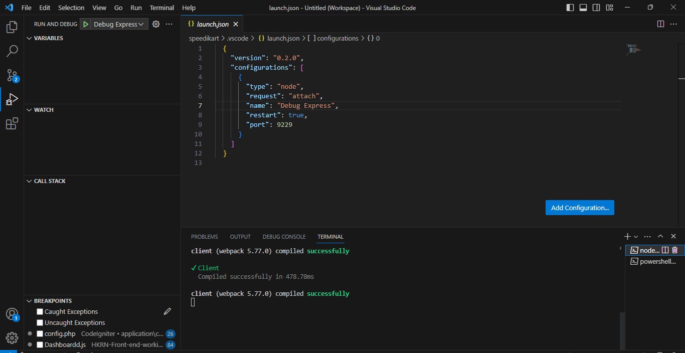
vscode/launch.json To show like this

  1. If you already have a launch configuration file, make sure to select it. Otherwise, click on "Add Configuration" to create a new launch.json file.

  2. In the launch.json file, you can replace the existing content with the following configuration:

{
"version": "0.2.0",
"configurations": [
{
"type": "node",
"request": "attach",
"name": "Debug Express",
"restart": true,
"port": 9229
}
]
}
  1. Save the launch.json file.

Step 3: Install Nodemon and Update the npm Script

Nodemon is a helpful tool that automatically restarts the Node.js application whenever changes are detected. Install Nodemon globally by running the following command:

npm install -g nodemon

Next, modify the "scripts" section in your package.json file to use Nodemon for starting the Express.js server:

"scripts": {
"start": "nodemon --inspect=0.0.0.0:9229 app.js"
}

Step 4: Start the Express.js Application

To start the Express.js application with Nodemon, open a terminal in VS Code (Ctrl+` ) and run the following command:

npm start

Step 5: Configure Chrome Browser for Debugging

To debug the application in the browser, we need to configure Chrome for debugging. Follow these steps:

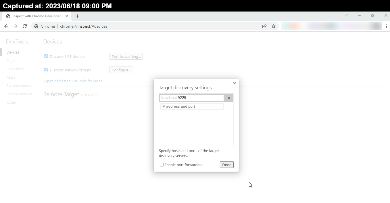
Open a new tab in Chrome Like this

  1. Open a new tab in Chrome and navigate to chrome://inspect.
  2. Click on the "Configure" button under "Discover network targets."
  3. Add localhost:9229 to the list of addresses.

Step 6: Start Debugging

Now it's time to start the debugging process:

  1. In VS Code, select the "Debug Express" configuration from the Debug dropdown menu (top left).
  2. Click the green "Play" button to start debugging.
  3. Set breakpoints in your code where you want to pause execution.

Step 7: Trigger a Browser Hit

To test the debugging setup, open a new tab

in your browser and navigate to http://localhost:3000. The execution should pause at the breakpoints, allowing you to inspect the code and variables.

Conclusion

You have successfully set up debugging in Express.js using VS Code and Nodemon. Debugging enables you to pinpoint and fix issues in your code more efficiently, ultimately improving the quality of your application.

Feel free to explore additional debugging features and tools available in VS Code to enhance your debugging experience further. Happy debugging!

The Sims 4 Debug Cheat

· 6 min read
Kamlesh
Quality Assurance @TestKarts

The Sims 4 Debug Cheat

The Sims 4, developed by Maxis and published by Electronic Arts, is a popular life simulation game that allows players to create and control virtual characters in a virtual world. One of the intriguing aspects of the game is the ability to access hidden objects and features through cheats. In this blog post, we will explore the Debug Cheat, a powerful tool that unlocks hidden objects in the game and enhances the creative possibilities for players.

List of Sim 4 Cheat Codes

List of cheat codes for The Sims 4:

  1. General Cheats:

    • testingcheats true: Enables testing cheats mode.
    • testingcheats false: Disables testing cheats mode.
    • motherlode: Gives you 50,000 Simoleons.
    • kaching: Gives you 1,000 Simoleons.
    • rosebud: Gives you 1,000 Simoleons (alternate code).
    • freerealestate on: Makes all houses in the neighborhood free (available in the Manage Worlds menu).
    • freerealestate off: Turns off free real estate.
    • headlineeffects on: Enables headline effects (plumbobs) for all Sims.
    • headlineeffects off: Disables headline effects.
  2. Build/Buy Mode Cheats:

    • bb.moveobjects: Allows you to move objects anywhere, including placing them outside the grid.
    • bb.enablefreebuild: Allows you to build/buy on locked lots.
    • bb.ignoregameplayunlocksentitlement: Unlocks all locked career objects in Build/Buy mode.
    • bb.showhiddenobjects: Unlocks hidden objects, including debug objects.
  3. Career Cheats:

    • careers.promote [CareerName]: Promotes the specified Sim in their career.
    • careers.demote [CareerName]: Demotes the specified Sim in their career.
    • careers.remove_career [CareerName]: Removes the specified Sim's career.
    • careers.add_career [CareerName]: Adds the specified career to the Sim.
  4. Relationship Cheats:

    • modifyrelationship [Sim1's Full Name] [Sim2's Full Name] [Value] [Relationship Type]: Modifies the relationship between two Sims.
    • sims.give_satisfaction_points [Value]: Gives the specified number of satisfaction points to the selected Sim.
  5. Sim Cheats:

    • cas.fulleditmode: Enables full editing mode in Create-a-Sim, allowing you to modify any Sim's traits, appearance, etc.
    • stats.set_skill_level [SkillName] [Level]: Sets the specified skill to the desired level for the selected Sim.
    • traits.equip_trait [TraitName]: Adds the specified trait to the selected Sim.
    • traits.remove_trait [TraitName]: Removes the specified trait from the selected Sim.

These are examples of cheat codes available in The Sims 4. Remember to use cheats responsibly and have fun experimenting with different aspects of the game.

Enabling the Debug Cheat

To activate the Debug Cheat in The Sims 4, follow these simple steps:

  1. Accessing the Cheat Console: Press Ctrl + Shift + C (or Command + Shift + C for Mac users) on your keyboard to open the cheat console. A text box will appear at the top of the screen.

  2. Enabling Testing Cheats: In the cheat console, type testingcheats true and press Enter. This cheat enables the testing cheats mode, allowing you to access various additional cheats and features.

  3. Unleashing Hidden Objects: With testing cheats enabled, type bb.showhiddenobjects in the cheat console and press Enter. This cheat grants you access to all hidden objects in the Build/Buy mode, including the coveted debug objects that are typically used by developers.

Exploring the Possibilities

By utilizing the Debug Cheat, a vast array of hidden objects becomes available for players to use and experiment with in their virtual worlds. Here are some key points to consider:

  1. Unlocked Debug Objects: The Debug Cheat reveals a wide range of objects that are not readily accessible in the regular game catalog. These objects include special decorations, debug versions of furniture, plants, vehicles, and even unique items used during game development. This cheat opens up a whole new world of creative possibilities for players.

  2. Enhanced Building and Decorating: With the Debug Cheat, players can take their building and decorating skills to new heights. They can incorporate unique and unconventional objects into their homes, create intricate outdoor spaces using hidden plants and landscaping elements, or even construct elaborate scenes or sets for storytelling purposes.

  3. Event Planning and Photography: The Debug Cheat offers valuable resources for event planning and photography within the game. Players can set up stunning backdrops and props for weddings, parties, or fashion shoots using exclusive objects that were previously unavailable. This feature allows for the creation of visually appealing and memorable moments in the virtual world.

  4. Experimenting with Game Mechanics: Debug objects can serve as useful tools for experimenting with various game mechanics. For instance, players can place specific debug items to test how Sims interact with them or observe their behavior in unique environments. This can help players gain a deeper understanding of the game's mechanics and unlock new strategies or storylines.

  5. Community Interaction: The Debug Cheat has also fostered a strong sense of community among players. Simmers frequently share their creations and discoveries involving debug objects on various online platforms. This exchange of ideas and inspiration has led to the development of mods, custom content, and challenges centered around debug objects, further enriching the overall gameplay experience.

Tips for Using the Debug Cheat

While the Debug Cheat provides exciting opportunities, it's essential to keep in mind a few tips for a smooth and enjoyable experience:

  1. Exercise Caution: Some debug objects might not function as expected or could cause issues within the game. It's crucial to use them with caution and ensure that they do not disrupt the overall gameplay or stability of your virtual world.

  2. Search Functionality: The Build/Buy mode includes a search bar that allows you to find specific objects quickly. Utilize this feature by typing

"debug" or "debug" followed by the name of the object you are looking for. This helps streamline the process and allows for efficient access to desired debug items.

  1. Regular Updates: As the game continues to evolve, updates and patches may alter the functionality or availability of certain debug objects. Stay informed about the latest updates from the game developers and modding communities to ensure compatibility and avoid any potential conflicts.

Conclusion

The Debug Cheat in The Sims 4 serves as a valuable tool for players to unlock hidden objects, expanding the creative possibilities within the game. From building and decorating to event planning and experimentation, the debug objects offer a myriad of opportunities for Simmers to enhance their gameplay experience. Remember to use the cheat responsibly, be mindful of potential issues, and enjoy the journey of discovering and utilizing these unique objects in your virtual world. Happy Simming!

Scope, Hoisting and Reassignment in JavaScript

· 5 min read
Kamlesh
Quality Assurance @TestKarts

Table of Contents


1. Understanding Scope, Hoisting and Reassignment

Let's embark on a journey to explore the fundamental concepts of scope, hoisting, and variable reassignment in JavaScript. By understanding these concepts, we can easily grasp the differences between var, let, and const declarations, comprehend their scoping rules, examine how hoisting impacts variable declarations, and determine whether reassignment is allowed. So, let's dive right in and unravel the mysteries of these essential JavaScript concepts!

Scope

In JavaScript, there are three types of scope:

  • Global Scope
  • Function Scope
  • Block Scope
  1. Global Scope: The global scope is the outermost scope in JavaScript and is accessible throughout the entire codebase. Variables declared in the global scope are accessible from any part of the code, including inside functions and blocks.

Example:

var x = 10;

function example() {
console.log(x); // Output: 10
}

example();

In the above example, x is declared in the global scope and can be accessed both inside the function example() and outside of it.

  1. Function Scope: Variables declared inside a function have function scope. They are accessible only within the function in which they are defined, and they are not accessible from outside the function.

Example:

function example() {
var x = 10;
console.log(x); // Output: 10
}

example();
console.log(x); // Output: ReferenceError: x is not defined

In the above example, x is defined inside the example() function and is accessible only within that function. Attempting to access x outside the function will result in a ReferenceError.

  1. Block Scope: Block scope was introduced in ECMAScript 2015 (ES6) with the introduction of let and const keywords. Variables declared with let and const have block scope, which means they are only accessible within the block in which they are defined. A block is typically delimited by curly braces {}.

Example:

function example() {
if (true) {
let x = 10;
const y = 20;
console.log(x); // Output: 10
console.log(y); // Output: 20
}
console.log(x); // Output: ReferenceError: x is not defined
console.log(y); // Output: ReferenceError: y is not defined
}

example();

In the above example, x and y are declared inside the if block and are accessible only within that block. Attempting to access x or y outside the block will result in a ReferenceError.


Reassignment

Variable reassignment refers to the act of assigning a new value to an already declared variable.

Here's an example in JavaScript:

let count = 5; //Assign
console.log(count); // Output: 5

count = 10; //Reassign
console.log(count); // Output: 10

count = count + 2; //Reassign
console.log(count); // Output: 12

In this example, the variable count is initially assigned a value of 5. Then, it is reassigned to a value of 10 and later updated by adding 2 to its current value, resulting in a final value of 12.

Variable reassignment allows for dynamic and flexible programming by allowing variables to store different values at different points in the program's execution. It enables the modification and manipulation of data throughout the program to reflect changing conditions or calculations.


Hoisting

Definition
  • Hoisting is a behavior in JavaScript where variable and function declarations are moved to the top of their containing scope during the compilation phase.
  • This means that regardless of where variables and functions are declared in the code, they are conceptually moved to the top of their respective scopes.

Here's a simplified example to illustrate hoisting:

The reason why variables and functions behave differently when hoisted in JavaScript is due to how they are initialized during the hoisting process.

1. In Case of Variable

  • Variable declarations are hoisted but not their assignments.
  • When a variable declaration is hoisted, it is moved to the top of its scope, but its assignment remains in place.

This is why variables declared with var are initially assigned a default value of undefined before the actual assignment statement is reached in the code.

2. In Case of function

  • On the other hand, function declarations are hoisted along with their complete definition, including the function body.

This means that the entire function, including its code, is moved to the top of its scope during the hoisting process. As a result, functions can be called and executed before their actual declaration in the code, without any undefined value.

To illustrate with an example:

var a = 20; // Initialize a
var b; // Declare b

console.log(x); // Output: undefined
var x = 5;

foo(); // Output: "Hello!"

function foo() {
console.log("Hello!");
}

In this code, the variable x is hoisted to the top of its scope, resulting in undefined when accessed before its assignment. On the other hand, the function foo() is hoisted along with its definition, so it can be called and executed without any undefined value.

It's important to note that this behavior applies specifically to function declarations and variables declared with var.

caution

Other forms of variable declaration, such as let and const, do not exhibit hoisting in the same way and will result in a ReferenceError if accessed before their declaration.

To avoid confusion caused by hoisting, it is generally recommended to declare variables at the beginning of their scope, rather than relying on hoisting to bring them to the top.

var vs let vs const in JavaScript

· 3 min read
Kamlesh
Quality Assurance @TestKarts

Table of Contents


Understanding the fundamental concepts of scope, hoisting, and variable reassignment in JavaScript is crucial in order to grasp the differences between var, let, and const declarations. If you're not familiar with these concepts.

Note- I recommend clicking here to learn more about scope, hoisting, and variable reassignment and gain a better understanding.

Main Differences:

  • var: It has function scope or global scope, is hoisted, allows reassignment, and is not block-scoped.
  • let: It has block scope, is not hoisted, allows reassignment, and is block-scoped.
  • const: It has block scope, is not hoisted, does not allow reassignment after initialization, and is block-scoped.

Understanding Key differences between var, let, and const Using Table

ScopeHoistingReassignmentBlock-Scoped
varFunction-scoped (or Global-scoped)HoistedAllowedNo
letBlock-scopedNot hoistedAllowedYes
constBlock-scopedNot hoistedNot allowedYes

Now let's provide examples to illustrate these differences:

  1. Scope:
    • var example:
function example() {
if (true) {
var x = 10;
}
console.log(x); // Output: 10
}
example();

The variable x declared with var inside the if block is accessible outside the block due to function scope.

  • let example:
function example() {
if (true) {
let x = 10;
}
console.log(x); // Output: ReferenceError: x is not defined
}
example();

The variable x declared with let inside the if block is not accessible outside the block due to block scope.

  • const example:
function example() {
if (true) {
const x = 10;
}
console.log(x); // Output: ReferenceError: x is not defined
}
example();

Similar to let, the variable x declared with const inside the if block is not accessible outside the block due to block scope.

  1. Hoisting:

    • var example:
    console.log(x); // Output: undefined
    var x = 10;
    console.log(x); // Output: 10

    Variables declared with var are hoisted to the top of their scope, which means they can be accessed before their declaration, but their initial value is undefined.

    • let example:
    console.log(x); // Output: ReferenceError: x is not defined
    let x = 10;
    console.log(x); // Output: 10

    Variables declared with let are not hoisted, and attempting to access them before their declaration results in a ReferenceError.

    • const example:
    console.log(x); // Output: ReferenceError: x is not defined
    const x = 10;
    console.log(x); // Output: 10

    Similar to let, variables declared with const are also not hoisted, and attempting to access them before their declaration results in a ReferenceError.

  2. Reassignment:

    • var example:
    var x = 10;
    x = 20;
    console.log(x); // Output: 20

    Variables declared with var can be reassigned to new values.

    • let example:
    let x = 10;
    x = 20;
    console.log(x); // Output: 20

    Variables declared with let can also be reassigned to new values.

    • const example:
    const x = 10;
    x = 20; // Error: Assignment to constant variable.

I encourage you to take another look at the table provided here and familiarize yourself with the key differences between var, let, and const declarations. Understanding these distinctions will help you effectively utilize and differentiate between these variable declaration keywords in JavaScript.

IdentificationA Vs Authentication Vs Authorization Vs Accountability

· 4 min read
Kamlesh
Quality Assurance @TestKarts

In today's digital world, ensuring the security and control of information and resources is of utmost importance. Four key concepts play a vital role in achieving this: identification, authentication, authorization, and accountability. These concepts work together to establish trust, verify identities, grant access, and track actions within systems and organizations. Let's explore these concepts further to understand their significance in maintaining secure and controlled environments.

Table of Contents


Identification

Identification refers to the process of recognizing and establishing the identity of a user or entity. It involves assigning a unique identifier to each user or entity to distinguish them from others. This identifier can be a username, employee ID, email address, or any other unique identifier.

1. Example: In an online banking system, when a user creates an account, they are asked to provide personal information such as their name, date of birth, and social security number. Once the account is created, the system assigns a unique account number to the user, which serves as their identification.

2. Example: Imagine you're at a party, and everyone is wearing a nametag with their name written on it. That name tag helps identify each person and makes it easier to know who is who.


Authentication

Authentication is the process of verifying the claimed identity of a user or entity. It ensures that the user or entity is who they claim to be. Authentication is typically based on something the user knows (e.g., a password), something they possess (e.g., a security token), or something they are (e.g., biometric characteristics).

1. Example: When a user tries to log in to an email account, they are prompted to enter their username and password. The system compares the entered credentials with the stored information and grants access if they match.

2. Example: Think of a secret club where only members are allowed inside. When you want to enter the club, you need to provide a special password or show your membership card. By doing this, you're authenticating yourself and proving that you are a club member.


Authorization

Authorization is the process of granting or denying access rights and permissions to authenticated users or entities. It involves determining what actions or resources a user is allowed to access based on their role, privileges, or permissions.

1. Example: In a file-sharing system, an administrator can grant read and write access to specific folders to certain users or user groups. The authorized users will be able to access and modify the files within those folders, while unauthorized users will be denied access.

2. Example: Imagine you're at a library, and there are different sections with books on various subjects. Each section has a locked door, and you need a specific key to open each door. The librarian gives you the right keys based on what sections you are authorized to access.


Accountability

Accountability refers to the concept of being responsible and answerable for one's actions. In the context of information systems, it involves tracking and logging the activities of users or entities to ensure that their actions can be traced back to them if necessary.

1. Example: In a network infrastructure, all user activities, such as login attempts, file access, and system modifications, are logged along with the corresponding timestamps and user identifiers. These logs provide an audit trail that can be used for forensic investigations or compliance purposes.

2. Example: Imagine you're part of a group project, and each member has a notebook where they write down what they did every day. This way, if something goes wrong or someone needs to know who did what, they can check the notebooks to find out and hold each person accountable for their contributions.

QA Analyst vs. Quality Assurance Tester

· 3 min read
Kamlesh
Quality Assurance @TestKarts

The field of quality assurance offers an array of opportunities, with QA analyst and QA tester being two common positions. While these roles share similarities, they involve distinct responsibilities. In this article, we will delve into the differences between QA analysts and QA testers, shedding light on their unique contributions to the quality assurance process. Additionally, we will explore other potential career paths within the realm of quality assurance.

QA Analyst: The Guardians of Product Quality

QA analysts shoulder the responsibility of ensuring the quality of digital products through rigorous testing. Collaborating closely with product developers and stakeholders, they meticulously create comprehensive test plans and cases. QA analysts execute these tests, keenly identifying and documenting any bugs or deficiencies encountered along the way. Their valuable insights and recommendations, provided through detailed reports, enable the product team to address and enhance the overall quality of the product. Moreover, QA analysts often play a pivotal role in training team members on best practices in testing.

QA Tester: The Gatekeepers of Software Quality

QA testers are primarily focused on evaluating software against specific standards and requirements. Armed with their technical expertise, they devise meticulous test plans and cases. These dedicated professionals execute both manual and automated tests, diligently identifying and reporting any defects they encounter. QA testers collaborate closely with developers, effectively reproducing and resolving issues to improve the software's quality. They may also harness the power of automation tools to streamline the testing process and maximize efficiency. Typically, QA testers hold a bachelor's degree in computer science or a related field, complemented by strong analytical and problem-solving skills.

Differentiating QA Analysts and QA Testers

To summarize the key distinctions between QA analysts and QA testers, let's explore their primary areas of focus:

Job Duties:

  • QA Analysts: These experts employ their in-depth knowledge to develop test plans, conduct research, evaluate existing QA processes, and propose improvements. Monitoring the project's progress, they provide valuable feedback on emerging issues and challenges.

  • QA Testers: With meticulous attention to detail, QA testers conduct both manual and automated testing, actively uncovering and reporting software bugs. They maintain detailed documentation of their testing process and collaborate with colleagues, sharing feedback and insights to drive product improvement before its release.

Job Requirements:

  • QA Analysts and Testers typically possess a bachelor's degree in computer science, IT, or a related field. Proficiency in various software testing tools and methodologies is crucial. Additionally, certifications from reputable organizations like the International Software Testing Qualifications Board (ISTQB) or the American Software Testing Qualifications Board (ASTQB) can further enhance one's qualifications.
in Short
  • QA analysts focus on overall product quality, process improvement, and collaboration with stakeholders,

  • QA testers concentrate on hands-on testing, defect identification, and reporting.

    Both roles play vital parts in ensuring the delivery of high-quality software and digital products.

As you embark on your quality assurance journey, it's worth exploring other career options within this field, such as quality assurance managers, test automation engineers, or performance testing specialists. Each role offers unique challenges and opportunities for growth, catering to diverse interests and skill sets. Embrace the realm of quality assurance, where your passion for excellence and attention to detail will pave the way for a fulfilling and impactful career.

Authentication and Authorization in Testing

· 3 min read
Kamlesh
Quality Assurance @TestKarts

In the realm of software testing, safeguarding the security and integrity of applications is of utmost importance. Among the critical elements that contribute to the overall security framework are authentication and authorization. These concepts play a pivotal role in verifying user identities and granting appropriate access privileges. In this blog post, we will delve into the significance of authentication and authorization in testing, exploring their purpose and impact on ensuring robust application security.

Table of Contents

Introduction

In the world of software testing, ensuring the security and integrity of applications is crucial. Two essential concepts that play a significant role in testing are authentication and authorization. These concepts focus on verifying the identity of users and granting appropriate access privileges. In this blog post, we will explore authentication and authorization in testing, their importance, and their impact on overall application security.

Authentication in Testing

Authentication is the process of verifying the identity of a user or system attempting to access an application or resource. In the context of testing, authentication ensures that only authorized users can access the system, preventing unauthorized access and protecting sensitive data.

During testing, authentication mechanisms can be thoroughly examined by considering the following scenarios:

  • Testing login functionality with valid credentials
  • Testing login functionality with invalid or incorrect credentials
  • Testing password reset and recovery processes
  • Testing multi-factor authentication (MFA) methods
  • Testing session management and expiration
  • Testing for potential vulnerabilities such as username enumeration, brute force attacks, or session fixation

By thoroughly testing authentication mechanisms, testers can identify vulnerabilities, weak points, or potential security risks, allowing developers to strengthen the authentication process.

Authorization in Testing

Authorization focuses on determining what actions or resources a user or system is allowed to access after successful authentication. It ensures that users have the necessary permissions to perform specific operations within the application.

During testing, authorization can be thoroughly validated by considering the following scenarios:

  • Testing different user roles and permissions
  • Testing access to various resources based on user roles
  • Testing boundary conditions and edge cases for authorization rules
  • Testing scenarios where unauthorized access attempts are made
  • Testing role changes and their impact on access rights
  • Testing for potential vulnerabilities such as insecure direct object references or privilege escalation

By thoroughly testing authorization mechanisms, testers can detect any loopholes or misconfigurations that could potentially lead to unauthorized access or data breaches.

Conclusion

In conclusion, authentication and authorization are vital aspects of testing that contribute to the overall security of an application. By properly testing these mechanisms, testers can identify and mitigate potential vulnerabilities, ensuring that only authorized users can access the system and perform appropriate actions. Robust authentication and authorization practices are essential for safeguarding sensitive data and maintaining the integrity of applications.

By paying attention to these critical elements during the testing phase, developers can enhance the overall security posture of their applications, providing a reliable and trustworthy user experience.

Remember, authentication and authorization testing should be an integral part of your overall testing strategy to ensure the security and protection of your application and its data.

Debugger Setup in CodeIgniter, VS Code for Windows

· 4 min read
Kamlesh
Quality Assurance @TestKarts

To set up debugging in CodeIgniter with VS Code on Windows, follow these steps:

Table of Contents


1. Install Xdebug

  • Download the appropriate Xdebug DLL file for your PHP version and architecture from the Xdebug website.

  • Place the downloaded DLL file in the PHP extension directory (e.g., C:\php\ext).

    For Example WampServer as following-

    To place the downloaded DLL file in the PHP extension directory for WampServer, follow these steps:

    1. Locate your WampServer installation directory. By default, it is installed in C:\wamp or C:\wamp64.

    2. Inside the WampServer installation directory, you'll find a subdirectory named bin. Open it.

    3. Inside the bin directory, you'll find another subdirectory named php. Open it.

    4. Inside the php directory, you'll find a subdirectory named ext. This is the directory where you should place the downloaded DLL file.

    5. Copy the downloaded Xdebug DLL file and paste it into the ext directory.

    6. Once the DLL file is placed in the ext directory, you need to configure it in WampServer.

    7. Right-click on the WampServer icon in the system tray and select "PHP" -> "php.ini".

    8. This will open the php.ini file in a text editor. Look for the [XDebug] section.

    9. Uncomment the line zend_extension = <path to the Xdebug DLL file> by removing the semicolon (;) at the beginning of the line.

    10. In open php.ini file and add the following lines at the end:

      [Xdebug]
      zend_extension = <path to the Xdebug DLL file> // For Example- zend_extension="c:/wamp64/bin/php/php8.0.26/ext/php_xdebug-3.2.1-8.0-vs16-x86_64.dll"
      xdebug.mode = debug
      xdebug.start_with_request = yes
      xdebug.client_port = 9000
      Dummy Example of Final php.ini File after xdebug setup

      ; XDEBUG Extension [xdebug] zend_extension="c:/wamp64/bin/php/php8.0.26/ext/php_xdebug-3.2.1-8.0-vs16-x86_64.dll"

      ;xdebug.mode allowed are : off develop coverage debug gcstats profile trace

      xdebug.mode = debug

      xdebug.start_with_request = yes

      xdebug.client_port = 9000

      xdebug.output_dir ="c:/wamp64/tmp"

      xdebug.show_local_vars=0

      xdebug.log="c:/wamp64/logs/xdebug.log"

      ;xdebug.log_level : 0 Criticals, 1 Connection, 3 Warnings, 5 Communication, 7 Information, 10 Debug Breakpoint

      xdebug.log_level=7

      xdebug.profiler_output_name=trace.%H.%t.%p.cgrind

      xdebug.use_compression=false

    11. Save the changes to the php.ini file and close the text editor.

    12. Restart the WampServer services to apply the changes. You can do this by right-clicking on the WampServer icon and selecting "Restart All Services".

    Now Xdebug should be installed and configured in WampServer. You can proceed with the remaining steps to configure Visual Studio Code and start debugging your CodeIgniter application.

2. Configure Xdebug

  • In your CodeIgniter project, open the application/config/autoload.php file.
  • Uncomment the $autoload['libraries'] line and add 'database' to the array. It should look like this:
    $autoload['libraries'] = array('database');
  • Open the application/config/config.php file.
  • Set $config['base_url'] to your CodeIgniter project's base URL (e.g., 'http://localhost/my_project/').
  • Set $config['index_page'] to an empty string ('').
  • Save the changes.

3. Configure Visual Studio Code

  • Install the PHP Debug extension in Visual Studio Code.
  • Open your project in Visual Studio Code.
  • Create a new file called .vscode/launch.json in the root directory of your project.
  • Add the following configuration to launch.json:
    {
    "version": "0.2.0",
    "configurations": [
    {
    "name": "Listen for Xdebug",
    "type": "php",
    "request": "launch",
    "port": 9000
    }
    ]
    }

4. Set Breakpoints

  • Open the PHP file in your CodeIgniter project where you want to set breakpoints.
  • Click on the left gutter of the line number where you want to set a breakpoint. A red dot should appear, indicating the breakpoint.

5. Start Debugging

  • In Visual Studio Code, press F5 or go to the "Run" menu and select "Start Debugging".
  • Open your browser and navigate to the page you want to debug in CodeIgniter.
  • Visual Studio Code should now stop at the breakpoints you set, allowing you to step through the code and inspect variables.

That's it! You have set up debugging in CodeIgniter with VS Code on Windows. Now you can debug your CodeIgniter application and examine its behavior during runtime.

Note: Ensure that your Xdebug and PHP versions are compatible.

Important Microsoft System Stored Procedures Lists

· 8 min read
Kamlesh
Quality Assurance @TestKarts

We have explored various system stored procedures in MS SQL Server that are useful for managing and optimizing your database operations. These stored procedures provide valuable information about objects, columns, constraints, indexes, user sessions, and much more. By leveraging these system stored procedures, you can gain insights into your database structure, troubleshoot issues, and improve query performance.

We have covered a wide range of system stored procedures, categorized based on their functionality. Each category includes relevant examples to demonstrate how these stored procedures can be used in practical scenarios. Whether you need to retrieve object definitions, analyze column information, list tables, manage users and logins, or monitor server activity, there is a system stored procedure available to assist you.

In SQL Server, indexing plays a crucial role in improving query performance by providing quick access to data stored in tables. This tutorial will guide you on how to index tables using various system stored procedures in MS SQL Server. We will cover the following categories of system stored procedures with examples:

  1. Object Information and Definition:

  2. Column Information:

  3. Table Listing:

  4. User and Session Information:

  5. Object Renaming:

  6. User and Login Management:

  7. Constraint Information:

  8. Database Renaming:

  9. Table Iteration and Manipulation:

  10. Foreign Key Information:

  11. Database Information:

  12. Statistics Update:

  13. Database Status Reset:

  14. Lock Information:

  15. Recompiling Objects:

  16. Detailed User and Session Information:

  17. External Script Execution:

  18. Data Compression Estimation:

  19. Error Log Cycling:

  20. Remote Server Information:

  21. SQL Server Monitoring:

  22. Trigger Information:

  23. User-Login Mapping:

  24. Database Space Reclamation:

  25. Server Configuration:

  26. Database Detachment:

  27. Job Information:

How to execute SQL statements in MS SQL Management Studio

To execute SQL statements in MS SQL Management Studio, follow these steps:

  1. Open MS SQL Management Studio.
  2. Connect to the desired SQL Server instance by providing the server name, authentication method, and credentials.
  3. Once connected, you will see the Object Explorer panel on the left side.
  4. Right-click on the desired database in the Object Explorer panel and select "New Query" from the context menu. Alternatively, you can use the shortcut Ctrl + N.
  5. This will open a new query window where you can write your SQL statements.
  6. Type or paste your SQL statements into the query window.
  7. To execute the SQL statements, you can either click the "Execute" button in the toolbar or use the shortcut key F5.
  8. The SQL statements will be sent to the server for execution, and the results will be displayed in the "Results" tab below the query window.
  • Finally you will see like this-

Finally you will see like this

Comman Way to execute SQL statement

tip

You can use the following format to execute SQL statements in MS SQL Management Studio:

  1. First Way
-- Example: Retrieving the definition of a stored procedure
EXEC sp_helptext 'usp_GetCustomerOrders'

To execute the statement:

  • Click on the 'Execute' button in MS SQL Server Management Studio.

--- OR

  1. Second Way
sp_helptext 'usp_GetCustomerOrders'

To execute the statement:

  • Select the SQL statement you want to execute, such as sp_helptext 'usp_GetCustomerOrders'.
  • Click on the 'Execute' button in MS SQL Server Management Studio.
info

Please note that the above tip can be followed for all the listed commands.

1. Object Information and Definition

Now let's dive into each system stored procedure category with examples.

sp_help

Provides detailed information about a specified object.

Example:

EXEC sp_help 'Customers'

sp_helptext

Retrieves the definition (source code) of a specified object.

Example:

EXEC sp_helptext 'usp_GetCustomerOrders'

Here how to excute

sp_helpindex

Provides information about the indexes defined on a specified table.

Example:

EXEC sp_help index 'Orders'

sp_depends

Retrieves the objects that depend on a specified object or the objects on which the specified object depends.

Example:

EXEC sp_depends 'usp_GetCustomerOrders'

2. Column Information

sp_columns

Retrieves information about the columns of a specified table.

Example:

EXEC sp_columns 'Customers'

3. Table Listing

sp_tables

Retrieves a list of tables available in the current or specified database.

Example:

EXEC sp_tables @table_name = 'Orders'

4. User and Session Information

sp_who

Displays information about current users, sessions, and processes connected to the SQL Server instance.

Example:

EXEC sp_who

5. Object Renaming

sp_rename

Renames a user-defined object, such as a table, column, or index.

Example:

EXEC sp_rename 'OldTableName', 'NewTableName', 'OBJECT'

6. User and Login Management

sp_adduser

Creates a new user associated with an existing login.

Example:

EXEC sp_adduser 'NewUser', 'ExistingLogin'

sp_addlogin

Creates a new login.

Example:

EXEC sp_addlogin 'NewLogin', 'Password'

7. Constraint Information

sp_helpconstraint

Retrieves information about the constraints defined on a table.

Example:

EXEC sp_helpconstraint 'Orders'

8. Database Renaming

sp_renamedb

Renames a user database in SQL Server.

Example:

EXEC sp_renamedb 'OldDatabaseName', 'NewDatabaseName'

9. Table Iteration and Manipulation

sp_msforeachtable

Executes a command or stored procedure on each table in the database.

Example:

EXEC sp_msforeachtable 'SELECT COUNT(*) FROM ?'

10. Foreign Key Information

sp_fkeys

Retrieves information about the foreign key constraints associated with a table.

Example:

EXEC sp_fkeys 'Orders'

11. Database Information

sp_helpdb

Provides information about all databases on the server or a specific database.

Example:

EXEC sp_helpdb

sp_helpfile

Retrieves information about the files of a specified database.

Example:

EXEC sp_helpfile 'YourDatabaseName'

sp_helpfilegroup

Retrieves information about the filegroups of a specified database.

Example:

EXEC sp_helpfilegroup 'YourDatabaseName'

12. Statistics Update

sp_updatestats

Updates the statistics for a specified table or all tables in a database.

Example:

EXEC sp_updatestats 'YourTableName'

13. Database Status Reset

sp_resetstatus

Resets the status of a database.

Example:

EXEC sp_resetstatus 'YourDatabaseName'

14. Lock Information

sp_lock

Displays information about locks currently held on resources.

Example:

EXEC sp_lock

15. Recompiling Objects

sp_recompile

Forces the recompilation of stored procedures or triggers.

Example:

EXEC sp_recompile 'YourStoredProcedureName'

16. Detailed User and Session Information

sp_who2

Provides detailed information about current users, sessions, and processes connected to the SQL Server instance.

Example:

EXEC sp_who2

17. External Script Execution

sp_execute_external_script

Executes R or Python scripts within SQL Server.

Example:

EXEC sp_execute_external_script @language = N'R', @script = N'YourScript'

18. Data Compression Estimation

sp_estimate_data_compression_savings

Estimates the potential space savings for data compression on a specific table.

Example:

EXEC sp_estimate_data_compression_savings 'YourTableName'

19. Error Log Cycling

sp_cycle_errorlog

Closes and cycles

the error log files in SQL Server.

Example:

EXEC sp_cycle_errorlog

20. Remote Server Information

sp_helpserver

Retrieves information about the remote servers configured in SQL Server.

Example:

EXEC sp_helpserver

21. SQL Server Monitoring

sp_monitor

Enables or disables the SQL Server monitoring feature.

Example:

EXEC sp_monitor @enable = 1

22. Trigger Information

sp_helptrigger

Retrieves information about the triggers defined on a specified table.

Example:

EXEC sp_helptrigger 'YourTableName'

23. User-Login Mapping

sp_change_users_login

Maps a user in a database to a login for database user synchronization.

Example:

EXEC sp_change_users_login 'Auto_Fix', 'YourUserName'

24. Database Space Reclamation

sp_clean_db_free_space

Reclaims unused space in a database.

Example:

EXEC sp_clean_db_free_space 'YourDatabaseName'

25. Server Configuration

sp_configure

Displays or changes server-level configuration options.

Example:

EXEC sp_configure 'max server memory', 8192

26. Database Detachment

sp_detach_db

Detaches a database from the server.

Example:

EXEC sp_detach_db 'YourDatabaseName'

27. Job Information

sp_help_job

Provides information about a specific SQL Server Agent job or all jobs.

Example:

EXEC sp_help_job @job_name = 'YourJobName'

Feel free to explore these system stored procedures in SQL Server and leverage them for managing and optimizing your database operations.

Conclusion

System stored procedures in MS SQL Server are powerful tools that provide essential information and functionalities for effective database management. By utilizing these stored procedures, you can enhance your productivity, optimize query performance, and gain valuable insights into your database objects and configurations.

Pagination in React JS Using React Bootstrap without using library

· 9 min read
Kamlesh
Quality Assurance @TestKarts

Introduction

The ability to paginate data is crucial when working with large datasets in web applications. Pagination allows us to divide the data into smaller, more manageable chunks, improving performance and user experience. In this tutorial, we will explore how to implement pagination in a React application. We'll use a sample employee report page to demonstrate the pagination functionality. We will implement a fully working pagination system in a React application without using any external libraries. We will leverage React Bootstrap for styling and create a custom pagination component from scratch.

Table of Contents

Introduction to Pagination

Pagination is a technique used to divide a large dataset into smaller, more manageable portions. It allows users to navigate through the data by displaying a subset of records on each page. Pagination is commonly used in web applications that deal with lists or tables of data.

Preview

Pagination in React JS Using React Bootstrap

Setting up the Project

Before we dive into implementing pagination, let's set up our React project. We'll use Create React App to quickly scaffold our application. Follow the steps below to create a new React project:

  1. Open your terminal and navigate to the desired directory.
  2. Run the following command to create a new React project:
    npx create-react-app pagination-demo
  3. Once the project is created, navigate into the project directory:
    cd pagination-demo
  4. Start the development server:
    npm start
    This command will start the development server and open your application in the browser.

Folder Structure

In your React project's src folder, you would have two files: EmpReports.js and CustomPagination.js.js. These files contain the code for the EmpReports component and the CustomPagination component, respectively.

pagination-demo
├── src
│ ├── EmpReports.js
│ ├── CustomPagination.js

Fetching API Data

In a real-world scenario, you would typically fetch the data from an API. For the purpose of this tutorial, we'll simulate the API data fetch by using a static array. Open the EmpReports.js file and replace the existing useEffect block with the following code:

useEffect(() => {
// Simulating API data fetch
const apiDataFetch = [
// Sample API data objects
];

setApiData(apiDataFetch);
}, []);

This code simulates the API data fetch and sets the fetched data in the apiData state.

Implementing the Employee Reports Page

Let's start implementing the Employee Reports page.

  • In the EmpReports component, we'll display the employee data in a table format with pagination and search box .
  • In the EmpReports.js file and update the return statement as follows:
return (
<div className='fluid container'>
<h2 className='mb-2 fw-50'>EmpReports</h2>
{/* Search input field */}
<input
style={{ width: '200px' }}
className='form-control mb-2'
placeholder='Search'
value={searchFilter}
onChange={handleFilter}
/>
{/* Employee Reports table */}
<Table striped bordered hover id='table'>
<tbody>
<tr>
<th style={{ width: '4%' }}>#</th>
<th>Employee Name</th>
<th>Age</th>
</tr>
{/* Render table rows */}
{paginatedData.length > 0 ? (
paginatedData.map((

item, i) => (
<tr key={i} style={{ background: '#fff' }}>
<td>{(currentPage - 1) * pageSize + i + 1}</td>
<td>{item.Name}</td>
<td>{item.age}</td>
</tr>
))
) : (
<tr>
<td colSpan='3'>No data found</td>
</tr>
)}
</tbody>
</Table>
{/* Render pagination component */}
{filteredData.length > 0 && (
<CustomPagination
itemsCount={filteredData.length}
itemsPerPage={pageSize}
currentPage={currentPage}
setCurrentPage={setCurrentPage}
alwaysShown={true}
/>
)}
</div>
);

This code adds a search input field and a table to display the employee reports. We also conditionally render the pagination component if there is data available.

Filtering Data

Next, let's implement the functionality to filter the data based on the search input. In the EmpReports.js component, add the following code inside the component:

// Filter the data based on search input
const handleFilter = (e) => {
setSearchFilter(e.target.value);
};

// Apply the filter to the data
const filteredData = apiData.filter(
(item) =>
item.Name.toLowerCase().includes(searchFilter.toLowerCase()) ||
item.age.toString().includes(searchFilter)
);

This code handles the search input change and filters the apiData based on the search input. The filtered data is stored in the filteredData state.

Paginating the Data

To implement pagination, we need to slice the filtered data based on the current page and the page size. Add the following code inside the EmpReports.js component:

// Slice the filtered data based on the current page and page size
const paginatedData = filteredData.slice(
(currentPage - 1) * pageSize,
currentPage * pageSize
);

This code uses the slice method to extract a subset of the filteredData based on the current page and page size. The resulting paginated data is stored in the paginatedData state.

  • Here is the complete code for EmpReports.js. In this example, apiDataFetch is used as a example for fetched data.
src/EmpReports.js
import React, { useEffect, useState } from 'react';
import { Table } from 'react-bootstrap';
import CustomPagination from './CustomPagination';

const EmpReports = () => {
const [apiData, setApiData] = useState([]); // set the api data
const [searchFilter, setSearchFilter] = useState(''); // filter the search
const [currentPage, setCurrentPage] = useState(1); // set the current page
const pageSize = 3; // show row in table
//replace this code with your api
useEffect(() => {
// Simulating API data fetch
const apiDataFetch = [
{ Name: 'John Doe', age: 25 },

{ Name: 'raja1', age: 25 },
{ Name: 'raja2', age: 25 },
{ Name: 'raja3', age: 25 },

{ Name: 'raja', age: 1 },
{ Name: 'raj', age: 3 },
{ Name: 'rajaji', age: 2 },

{ Name: 'paras', age: 2 },
{ Name: 'raja', age: 1 },
{ Name: 'raj', age: 3 },

{ Name: 'rajaji', age: 2 },
{ Name: 'paras', age: 2 },

// Add more objects as needed // or replace
];

setApiData(apiDataFetch);
}, []);

//end heare

useEffect(() => {
setCurrentPage(1);
}, [searchFilter]);

const handleFilter = (e) => {
setSearchFilter(e.target.value);
};

const filteredData = apiData.filter(
(item) =>
item.Name.toLowerCase().includes(searchFilter.toLowerCase()) ||
item.age.toString().includes(searchFilter)
);

const paginatedData = filteredData.slice(
(currentPage - 1) * pageSize,
currentPage * pageSize
);

return (
<div className='fluid container'>
<div className='mb-2 fw-50'>EmpReports</div>
<input
style={{ width: "200px" }}
className='form-control mb-2'
placeholder='Search'
value={searchFilter}
onChange={handleFilter}
/>
<Table striped bordered hover id='table'>
<tbody>
<tr>
<th style={{ width: '4%' }}>#</th>
<th>Employee Name</th>
<th>Age</th>
</tr>
{paginatedData.length > 0 ? (
paginatedData.map((item, i) => (
<tr key={i} style={{ background: '#fff' }}>
<td>{(currentPage - 1) * pageSize + i + 1}</td>
<td>{item.Name}</td>
<td>{item.age}</td>
</tr>
))
) : (
<tr>
<td colSpan="3">No data found</td>
</tr>
)}
</tbody>
</Table>
{filteredData.length > 0 &&
<>
<CustomPagination
itemsCount={filteredData.length}
itemsPerPage={pageSize}
currentPage={currentPage}
setCurrentPage={setCurrentPage}
alwaysShown={true}
/>
</>
}
</div>
);
};

export default EmpReports;

Creating the Custom Pagination Component

Now let's create a reusable CustomPagination component that will handle the pagination UI. Create a new file called CustomPagination.js and add the following code:

// Import necessary dependencies
import React, { useEffect } from 'react';
import Pagination from 'react-bootstrap/Pagination';
import PropTypes from 'prop-types';

const CustomPagination = ({
itemsCount,
itemsPerPage,
currentPage,
setCurrentPage,
alwaysShown = true,
}) => {
// Pagination logic goes here

return (
<>
{/* Render the pagination UI */}
</>
);
};

CustomPagination.propTypes = {
itemsCount: PropTypes.number.isRequired,
currentPage: PropTypes.number.isRequired,
setCurrentPage: PropTypes.func.isRequired,
alwaysShown: PropTypes.bool,
};

export default CustomPagination;

This code sets up the basic structure of the CustomPagination.js component and defines the required props.

Styling the Pagination Component

To style the pagination component, we can use the Bootstrap Pagination component. Add the following code inside the CustomPagination.js component:

return (
<>
{isPaginationShown && (
<Pagination>
{/* Previous page button */}
<Pagination.Prev
className={isCurrentPageFirst ? 'disable' : ''}
onClick={onPreviousPageClick}
disabled={isCurrentPageFirst}
/>
{/* Render page numbers */}
{pageNumbers}
{/* Next page button */}
<Pagination.Next
onClick={onNextPageClick}
disabled={isCurrentPageLast}
className={isCurrentPageLast ? 'disable' : ''}
/>
</Pagination>
)}
</>
);

This code uses the Bootstrap Pagination component to render the pagination UI. It includes the previous page button, page numbers, and next page button.

  • Here is the complete code for CustomPagination.js. In this example, apiDataFetch is used as a example for fetched data.
src/CustomPagination.js
import React, { useEffect } from "react";
import Pagination from "react-bootstrap/Pagination";
import PropTypes from "prop-types";

const CustomPagination = ({
itemsCount,
itemsPerPage,
currentPage,
setCurrentPage,
alwaysShown = true
}) => {

const pagesCount = Math.ceil(itemsCount / itemsPerPage);
const isPaginationShown = alwaysShown ? true : pagesCount > 1;
const isCurrentPageFirst = currentPage === 1;
const isCurrentPageLast = currentPage === pagesCount;
const changePage = number => {
if (currentPage === number) return;
setCurrentPage(number);
// scrollToTop();
};
const onPageNumberClick = pageNumber => {
changePage(pageNumber);
};

const onPreviousPageClick = () => {
if (currentPage <= 1) {
return (changePage(currentPage => currentPage = 1));
} else {
changePage(currentPage => currentPage - 1);
}

};

const onNextPageClick = () => {
changePage(currentPage => currentPage + 1);
};

const setLastPageAsCurrent = () => {
if (currentPage > pagesCount) {
pagesCount && setCurrentPage(pagesCount);
}
};

let isPageNumberOutOfRange;

const pageNumbers = [...new Array(pagesCount)].map((_, index) => {
const pageNumber = index + 1;
const isPageNumberFirst = pageNumber === 1;
const isPageNumberLast = pageNumber === pagesCount;
const isCurrentPageWithinTwoPageNumbers =
Math.abs(pageNumber - currentPage) <= 2;

if (
isPageNumberFirst ||
isPageNumberLast ||
isCurrentPageWithinTwoPageNumbers
) {
isPageNumberOutOfRange = false;
return (
<Pagination.Item
activeLabel=""
key={pageNumber}
onClick={() => onPageNumberClick(pageNumber)}
active={pageNumber === currentPage}
>
{pageNumber}
</Pagination.Item>
);
}

if (!isPageNumberOutOfRange) {
isPageNumberOutOfRange = true;
return <Pagination.Ellipsis key={pageNumber} className="muted" />;
}

return null;
});

useEffect(setLastPageAsCurrent, [pagesCount]);

return (
<>
{isPaginationShown && (
<Pagination>
<Pagination.Prev
className={isCurrentPageFirst ? "disable" : ""}
onClick={onPreviousPageClick}
disabled={isCurrentPageFirst}
/>
{pageNumbers}
<Pagination.Next
onClick={onNextPageClick}
disabled={isCurrentPageLast}
className={isCurrentPageLast ? "disable" : ""}
/>
</Pagination>
)}
</>
);
};

CustomPagination.propTypes = {
itemsCount: PropTypes.number.isRequired,
currentPage: PropTypes.number.isRequired,
setCurrentPage: PropTypes.func.isRequired,
alwaysShown: PropTypes.bool
};

export default CustomPagination;

Conclusion

In this tutorial, we explored how to implement pagination in a React application. We started by setting up the project and fetching the API data. Then, we implemented the Employee Reports page with filtering and pagination functionality. We also created a custom pagination component and styled it using Bootstrap.

Pagination is a powerful tool for handling large datasets and improving the performance of your web applications. By implementing pagination, you can provide a better user experience and ensure that your application remains responsive even with substantial amounts of data.

Feel free to customize and enhance the pagination implementation according to your specific requirements. Happy coding!

I hope you find this tutorial helpful! If you have any further questions, feel free to ask.

How to Create a Responsive Horizontal Scrolling Card Slider in JavaScript

· 7 min read
Kamlesh
Quality Assurance @TestKarts

Introduction:

Horizontal scrolling is a popular UI pattern used in many modern web applications. A horizontal card slider is a similar design pattern that allows users to scroll through a set of cards horizontally. In this tutorial, we'll be using JavaScript and CSS to create a horizontal card slider with forward and backward scrolling buttons. Horizontal Card slider with arrow

Features:

  • Step-by-step instructions: The post provides a detailed and easy-to-follow tutorial on how to create a horizontal scrolling card with forward and back buttons.

  • Interactive functionality: The post provides code that allows users to interact with the horizontal scrolling card by clicking on the forward and back buttons to slide the cards left or right.

  • End-of-scroll detection: The post includes code to detect when the horizontal scroll has reached either end, and disables the relevant button to prevent users from scrolling further.

  • Default state: The post explains how to set the default state of the horizontal scroll to be at the leftmost card and disable the back button.

  • Customizable code: The post provides code that can be customized to fit different design and functionality requirements.

Implementation:

To create a horizontal card slider, we first need to create a container element with a fixed width and overflow-x set to scroll. Inside the container, we'll add a set of card elements that are floated left and have a fixed width.

Next, we'll use JavaScript to detect when the slider reaches the left or right end and disable the corresponding arrow button. We'll also add event listeners to the arrow buttons to scroll the slider left or right when clicked.

Here's the complete code to implement a horizontal card slider with forward and backward scrolling buttons:

Here are the steps to follow:

Step 1: Create the HTML markup

Create an HTML element to hold the cards that will be horizontally scrolled. Inside this element, create a container for the cards that will be scrolled. Each card should be wrapped in a div element. Here's an example:

<!DOCTYPE html>
<html lang="en">
<head>
<meta charset="UTF-8" />
<meta name="viewport" content="width=device-width, initial-scale=1.0" />
<meta http-equiv="X-UA-Compatible" content="ie=edge" />
<script src="https://kit.fontawesome.com/a59b9b09ab.js" crossorigin="anonymous"></script>
<link rel="stylesheet" href="https://cdn.jsdelivr.net/npm/bootstrap@4.3.1/dist/css/bootstrap.min.css" integrity="sha384-ggOyR0iXCbMQv3Xipma34MD+dH/1fQ784/j6cY/iJTQUOhcWr7x9JvoRxT2MZw1T" crossorigin="anonymous">
<script src="https://cdn.jsdelivr.net/npm/bootstrap@4.3.1/dist/js/bootstrap.min.js" integrity="sha384-JjSmVgyd0p3pXB1rRibZUAYoIIy6OrQ6VrjIEaFf/nJGzIxFDsf4x0xIM+B07jRM" crossorigin="anonymous"></script>
<link rel="stylesheet" href="style.css" />
<title>Static Template</title>
</head>

<body>
<div class="cover">
<button class="left" onclick="leftScroll()">
<i class="fas fa-angle-double-left"></i>
</button>
<div class="scroll-images">
<div class="child">
<svg xmlns="http://www.w3.org/2000/svg" width="16" height="16" fill="currentColor" class="bi bi-1-circle-fill" viewBox="0 0 16 16">
<path d="M16 8A8 8 0 1 1 0 8a8 8 0 0 1 16 0ZM9.283 4.002H7.971L6.072 5.385v1.271l1.834-1.318h.065V12h1.312V4.002Z"/>
</svg>
<h4>Card 1</h4>
</div>
<div class="child">
<svg xmlns="http://www.w3.org/2000/svg" width="16" height="16" fill="currentColor" class="bi bi-2-circle-fill" viewBox="0 0 16 16">
<path d="M16 8A8 8 0 1 1 0 8a8 8 0 0 1 16 0ZM6.646 6.24c0-.691.493-1.306 1.336-1.306.756 0 1.313.492 1.313 1.236 0 .697-.469 1.23-.902 1.705l-2.971 3.293V12h5.344v-1.107H7.268v-.077l1.974-2.22.096-.107c.688-.763 1.287-1.428 1.287-2.43 0-1.266-1.031-2.215-2.613-2.215-1.758 0-2.637 1.19-2.637 2.402v.065h1.271v-.07Z"/>
</svg>
<h4>Card 2</h4>
</div>
<div class="child">
<svg xmlns="http://www.w3.org/2000/svg" width="16" height="16" fill="currentColor" class="bi bi-3-circle-fill" viewBox="0 0 16 16">
<path d="M16 8A8 8 0 1 1 0 8a8 8 0 0 1 16 0Zm-8.082.414c.92 0 1.535.54 1.541 1.318.012.791-.615 1.36-1.588 1.354-.861-.006-1.482-.469-1.54-1.066H5.104c.047 1.177 1.05 2.144 2.754 2.144 1.653 0 2.954-.937 2.93-2.396-.023-1.278-1.031-1.846-1.734-1.916v-.07c.597-.1 1.505-.739 1.482-1.876-.03-1.177-1.043-2.074-2.637-2.062-1.675.006-2.59.984-2.625 2.12h1.248c.036-.556.557-1.054 1.348-1.054.785 0 1.348.486 1.348 1.195.006.715-.563 1.237-1.342 1.237h-.838v1.072h.879Z"/>
</svg>
<h4>Card 3</h4>
</div>
<div class="child">
<svg xmlns="http://www.w3.org/2000/svg" width="16" height="16" fill="currentColor" class="bi bi-4-circle-fill" viewBox="0 0 16 16">
<path d="M16 8A8 8 0 1 1 0 8a8 8 0 0 1 16 0ZM7.519 5.057c-.886 1.418-1.772 2.838-2.542 4.265v1.12H8.85V12h1.26v-1.559h1.007V9.334H10.11V4.002H8.176c-.218.352-.438.703-.657 1.055ZM6.225 9.281v.053H8.85V5.063h-.065c-.867 1.33-1.787 2.806-2.56 4.218Z"/>
</svg>
<h4>Card 4</h4>
</div>
<div class="child">
<svg xmlns="http://www.w3.org/2000/svg" width="16" height="16" fill="currentColor" class="bi bi-5-circle-fill" viewBox="0 0 16 16">
<path d="M16 8A8 8 0 1 1 0 8a8 8 0 0 1 16 0Zm-8.006 4.158c1.74 0 2.924-1.119 2.924-2.806 0-1.641-1.178-2.584-2.56-2.584-.897 0-1.442.421-1.612.68h-.064l.193-2.344h3.621V4.002H5.791L5.445 8.63h1.149c.193-.358.668-.809 1.435-.809.85 0 1.582.604 1.582 1.57 0 1.085-.779 1.682-1.57 1.682-.697 0-1.389-.31-1.53-1.031H5.276c.065 1.213 1.149 2.115 2.72 2.115Z"/>
</svg>
<h4>Card 5</h4>
</div>
<div class="child">
<svg xmlns="http://www.w3.org/2000/svg" width="16" height="16" fill="currentColor" class="bi bi-6-circle-fill" viewBox="0 0 16 16">
<path d="M16 8A8 8 0 1 1 0 8a8 8 0 0 1 16 0ZM8.21 3.855c-1.868 0-3.116 1.395-3.116 4.407 0 1.183.228 2.039.597 2.642.569.926 1.477 1.254 2.409 1.254 1.629 0 2.847-1.013 2.847-2.783 0-1.676-1.254-2.555-2.508-2.555-1.125 0-1.752.61-1.98 1.155h-.082c-.012-1.946.727-3.036 1.805-3.036.802 0 1.213.457 1.312.815h1.29c-.06-.908-.962-1.899-2.573-1.899Zm-.099 4.008c-.92 0-1.564.65-1.564 1.576 0 1.032.703 1.635 1.558 1.635.868 0 1.553-.533 1.553-1.629 0-1.06-.744-1.582-1.547-1.582Z"/>
</svg>
<h4>Card 6</h4>
</div>
<div class="child">
<svg xmlns="http://www.w3.org/2000/svg" width="16" height="16" fill="currentColor" class="bi bi-7-circle-fill" viewBox="0 0 16 16">
<path d="M16 8A8 8 0 1 1 0 8a8 8 0 0 1 16 0ZM5.37 5.11h3.972v.07L6.025 12H7.42l3.258-6.85V4.002H5.369v1.107Z"/>
</svg>
<h4>Card 7</h4>
</div>
<div class="child">
<svg xmlns="http://www.w3.org/2000/svg" width="16" height="16" fill="currentColor" class="bi bi-8-circle-fill" viewBox="0 0 16 16">
<path d="M16 8A8 8 0 1 1 0 8a8 8 0 0 1 16 0Zm-5.03 1.803c0-1.248-.943-1.84-1.646-1.992v-.065c.598-.187 1.336-.72 1.336-1.781 0-1.225-1.084-2.121-2.654-2.121-1.57 0-2.66.896-2.66 2.12 0 1.044.709 1.589 1.33 1.782v.065c-.697.152-1.647.732-1.647 2.003 0 1.39 1.19 2.344 2.953 2.344 1.77 0 2.989-.96 2.989-2.355Zm-4.347-3.71c0 .739.586 1.255 1.383 1.255s1.377-.516 1.377-1.254c0-.733-.58-1.23-1.377-1.23s-1.383.497-1.383 1.23Zm-.281 3.645c0 .838.72 1.412 1.664 1.412.943 0 1.658-.574 1.658-1.412 0-.843-.715-1.424-1.658-1.424-.944 0-1.664.58-1.664 1.424Z"/>
</svg>
<h4>Card 8</h4>
</div>
<div class="child">
<svg xmlns="http://www.w3.org/2000/svg" width="16" height="16" fill="currentColor" class="bi bi-9-circle-fill" viewBox="0 0 16 16">
<path d="M16 8A8 8 0 1 1 0 8a8 8 0 0 1 16 0Zm-8.223 4.146c2.104 0 3.123-1.464 3.123-4.3 0-3.147-1.459-4.014-2.97-4.014-1.63 0-2.871 1.02-2.871 2.73 0 1.706 1.171 2.667 2.566 2.667 1.06 0 1.7-.557 1.934-1.184h.076c.047 1.67-.475 3.023-1.834 3.023-.71 0-1.149-.363-1.248-.72H5.258c.094.908.926 1.798 2.52 1.798Zm.118-3.972c.808 0 1.535-.528 1.535-1.594s-.668-1.676-1.56-1.676c-.838 0-1.517.616-1.517 1.659 0 1.072.708 1.61 1.54 1.61Z"/>
</svg>
<h4>Card 9</h4>
</div>
</div>
<button class="right" onclick="rightScroll()">
<i class="fas fa-angle-double-right"></i>
</button>
</div>
</body>
</html>

Step 2: Add CSS

Add CSS to create the horizontal scroll effect. Set the scroll-container element to overflow-x: scroll to allow horizontal scrolling. Set the width of each card to the desired width and make sure they are displayed inline-block. Here's an example:

.cover {
position: relative;
padding: 0px 30px;
margin-top: 100px;
}

.left {
position: absolute;
left: 0;
top: 50%;
transform: translateY(-50%);
}

.right {
position: absolute;
right: 0;
top: 50%;
transform: translateY(-50%);
}

.scroll-images {
position: relative;
width: 100%;
padding: 40px 0px;
height: auto;
display: flex;
flex-wrap: nowrap;
overflow-x: hidden;
overflow-y: hidden;
scroll-behavior: smooth;
-webkit-overflow-scrolling: touch;
}

.child {
display: flex;
justify-content: center;
align-items: center;
min-width: 250px;
height: 200px;
padding: 0px 15px;
margin: 1px 10px;
border: 1px solid #f1f1f1;
overflow: hidden;
-webkit-box-shadow: 0px 0px 15px 2px rgb(0 0 0 / 10%);;
box-shadow: 0px 0px 15px 2px rgb(0 0 0 / 10%);;
}

.child img, .child > svg {
position: absolute;
margin-top: -195px;
width: 80px;
height: 80px;
object-fit: cover;
object-position: center;
border-radius: 50%;
background: #03A9F4;
}

.scroll-images::-webkit-scrollbar {
width: 5px;
height: 8px;
background-color: #aaa;
}

.scroll-images::-webkit-scrollbar-thumb {
background-color: black;
}

button {
background-color: transparent;
border: none;
outline: none;
cursor: pointer;
font-size: 25px;
}

Step 3: Add JavaScript

Add JavaScript to handle the scrolling and enable/disable the arrow buttons. Here's an example:

document.addEventListener("DOMContentLoaded", function () {
const scrollImages = document.querySelector(".scroll-images");
const scrollLength = scrollImages.scrollWidth - scrollImages.clientWidth;
const leftButton = document.querySelector(".left");
const rightButton = document.querySelector(".right");

function checkScroll() {
const currentScroll = scrollImages.scrollLeft;
if (currentScroll === 0) {
leftButton.setAttribute("disabled", "true");
rightButton.removeAttribute("disabled");
} else if (currentScroll === scrollLength) {
rightButton.setAttribute("disabled", "true");
leftButton.removeAttribute("disabled");
} else {
leftButton.removeAttribute("disabled");
rightButton.removeAttribute("disabled");
}
}

scrollImages.addEventListener("scroll", checkScroll);
window.addEventListener("resize", checkScroll);
checkScroll();

function leftScroll() {
scrollImages.scrollBy({
left: -200,
behavior: "smooth"
});
}

function rightScroll() {
scrollImages.scrollBy({
left: 200,
behavior: "smooth"
});
}

leftButton.addEventListener("click", leftScroll);
rightButton.addEventListener("click", rightScroll);
});

Customize the JavaScript to fit your specific needs. For example, you may need to change the width of each card or the amount that the scroll container scrolls when the arrow buttons are clicked.

And that's it! With these steps, you can create a card horizontal scrolling with forward and back arrow buttons that enable/disable depending on the scroll position.

Try on CodePen :-

Create a responsive multiple card with equal size and height using Html, CSS and React

· 6 min read
Kamlesh
Quality Assurance @TestKarts

In modern web design, it is crucial to create responsive and visually appealing layouts that work across various devices. One of the most popular design elements is cards that can be used to display various types of content in a compact and visually pleasing way. In this blog, we will walk through how to create a responsive multiple card with equal size and height using HTML, CSS, and React.

Preview-